Project 1
Explored options for on-page AI virtual assistant and the close/end feature
Overview
I worked independently with management oversight, on the research and exploration of what an on-page virtual assistant would look like and how it would operate along side the current functionalities. I inherited the project from management who gave me feedback from engineering and product.
| My Role: | UX Designer |
|---|---|
| Responsibilities | Exploratory research, interactions, collaborate on strategy, wireframes, design iterations. |
| Collaborators | Dir of UX |
| Timeline | 10 weeks |
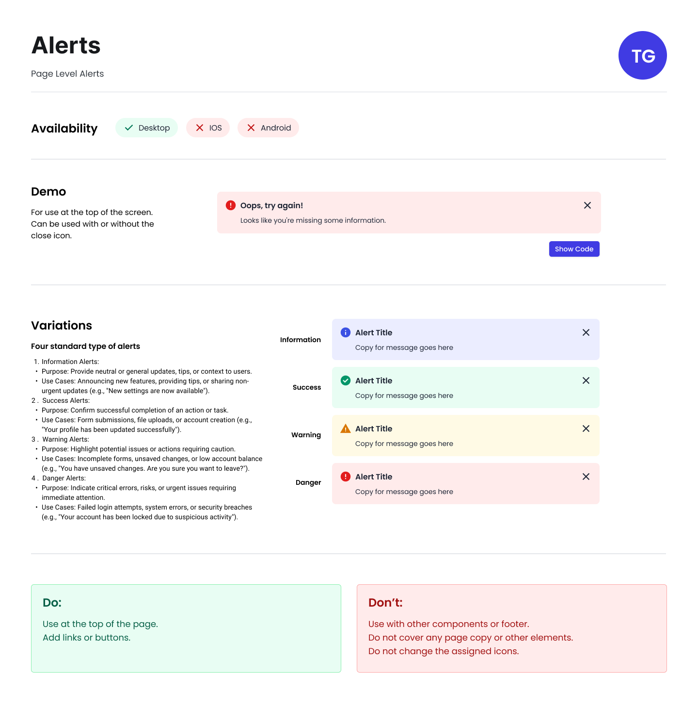
The Problem
Current search functionality is insufficient, leading to increased customer service volume as users aren't satisfied the information they are finding. Users are abandoning self-service options and defaulting to phone support. Business wants to implement a conversational AI assistant that extends search capabilities by engaging users in follow-up dialogue.
Goals
- Decide if an on-page virtual assistant or a traditional chatbot would be the best user experience.
- User would get personalized guidance by receiving information specific to their needs.
- Reduce support costs by deflect customer service inquiries by helping users complete tasks independently.
- User avoids dead ends by getting alternative options when initial search results don't lead to actionable solutions
Research
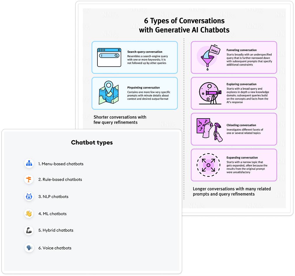
Two weeks was spent on research to learn about AI technology, chatbot types, conversation types, how to build a chatbot, what is machine learning. Samples of different chat interfaces on website and how others treated the UI. Everything I could think of to look up and learn about the product I was involved with.
Process
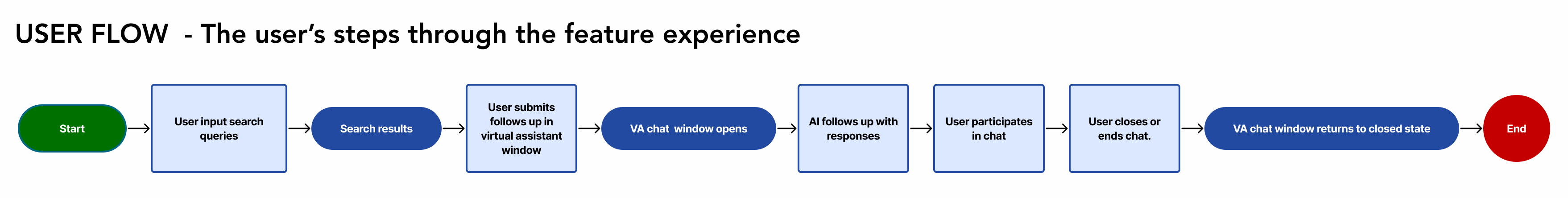
Working with the Dir of UX, we developed multiple ideas and formed using the two use cases that I mapped out in a flow chart. How would closing the AI window work within the on-page environment? What type of UI would be the most user friendly? Is there a button feature or do we rely on icon representation? This is not like a typical chatbot, so how do we address this problem?
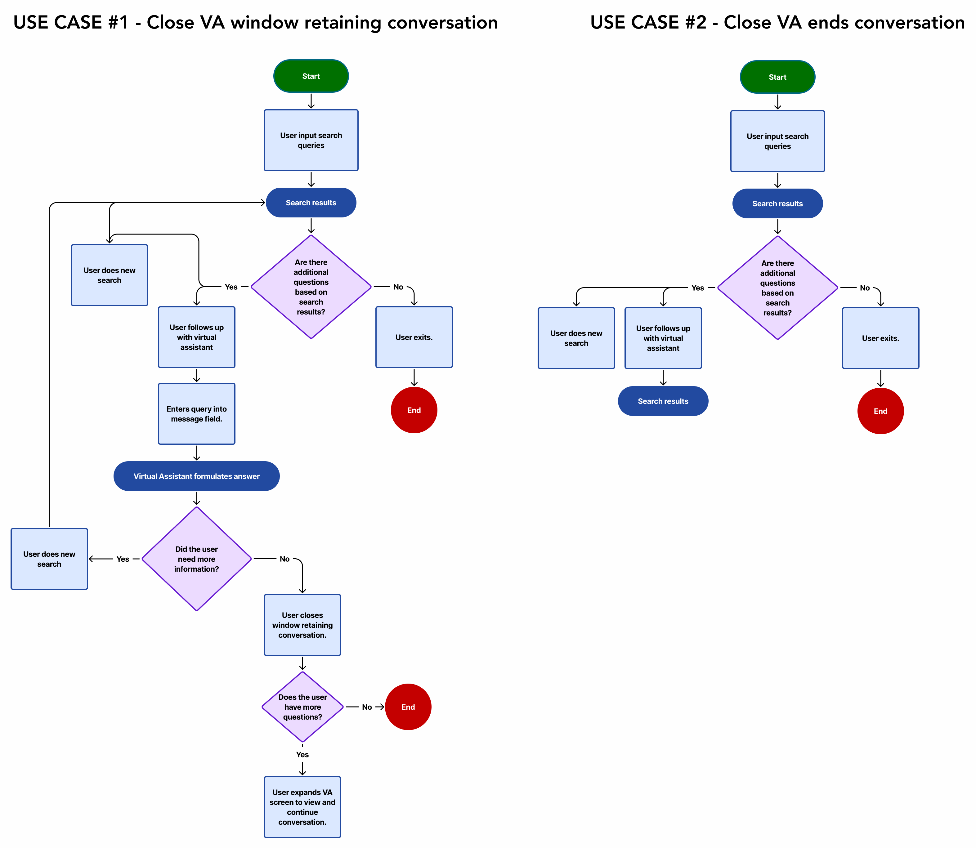
Possible solutions to close feature
I worked through several iterations of the close feature and how it could possibly work within the body of the search page.
- Closes conversation, but doesn't delete it. User can reopen window and continue.
- Closes conversation, but doesn't delete it unless user ends chat. User can reopen window and continue.
- Closes conversation, but doesn't delete it unless user ends chat. User can reopen window and continue if chat is not cancelled.
- Option of closing the window to continue the conversation later or ending the chat.
- Ends conversation completely and closes the chat window.
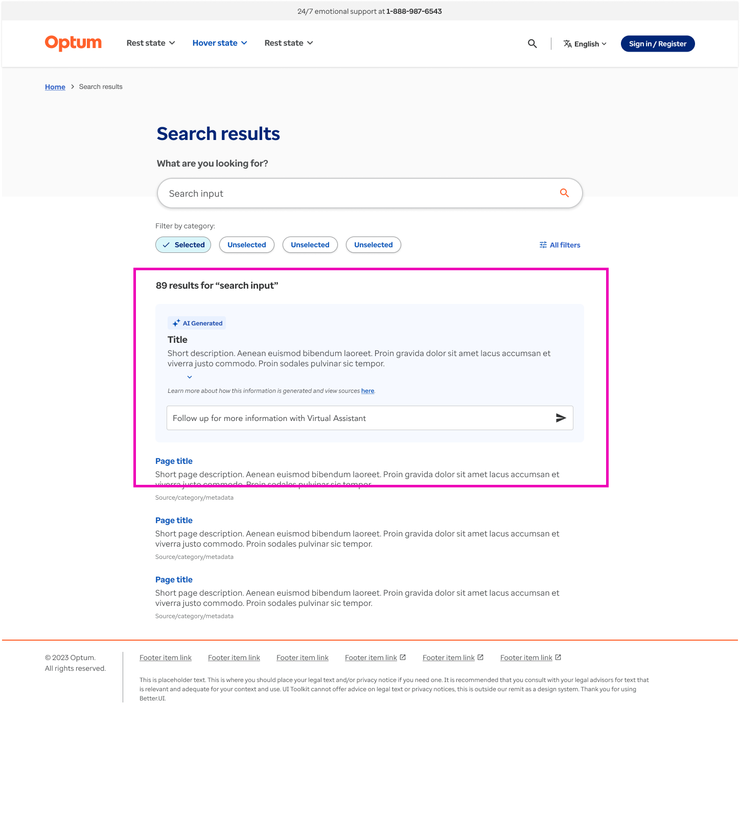
Exploration of virtual assistant close feature.
Possibilities for the virtual assistant
The virtual assistant will temporarily work as added support to the search results, but it needs to be scalable to include capabilities for additional conversations. What would that look like for the interface and would it function the same? A user flow was mapped out to help plan in interations.
Questions and pain points
- Should this be more like a traditional chatbot?
- What is the purpose of it being in-page?
- Can this technology work within the page?
- Should the va be brought to it's own page and work within a modal structure?
- Is it intuitive enough for the user not being in typical place of bottom right corner?
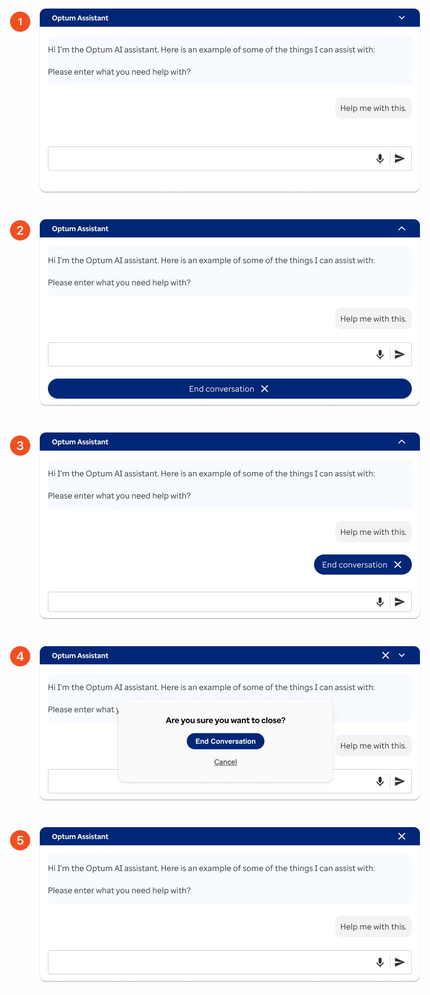
Virtual assistant in closed state.
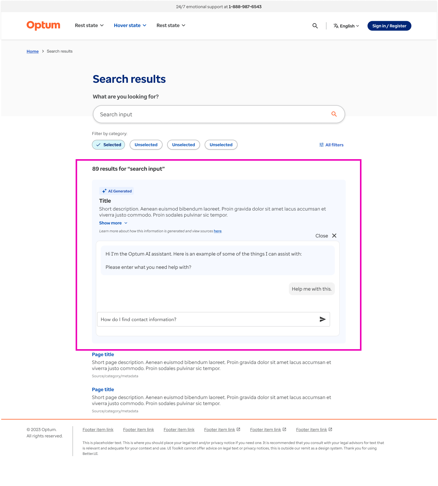
Virtual assistant in open state.
The Solution
The project was not incomplete. Information was lacking including requirements and engineering participation. Apart from that, I feel the iterations were a good start and managed the project with few resources.
Project 2
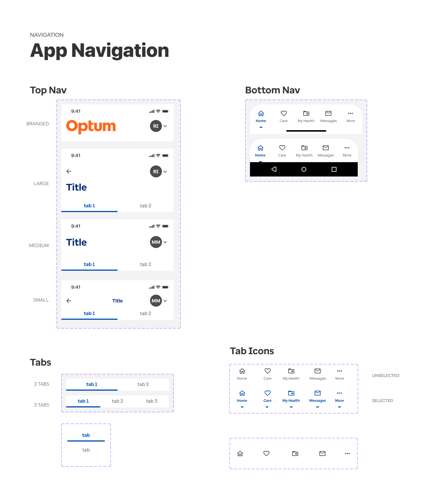
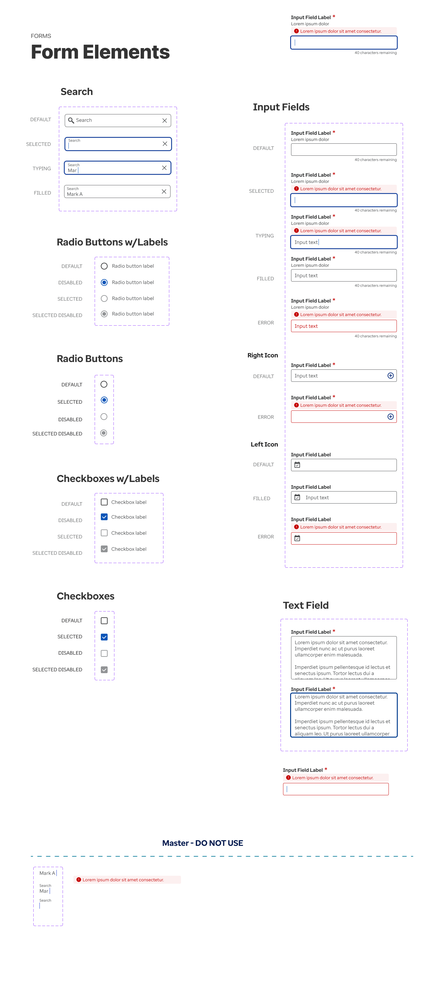
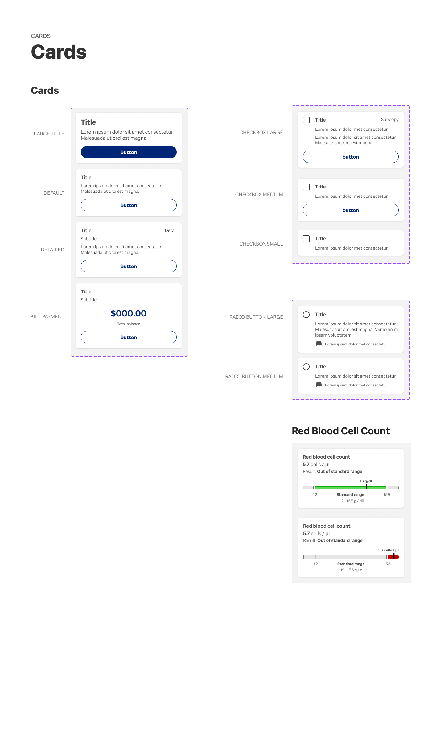
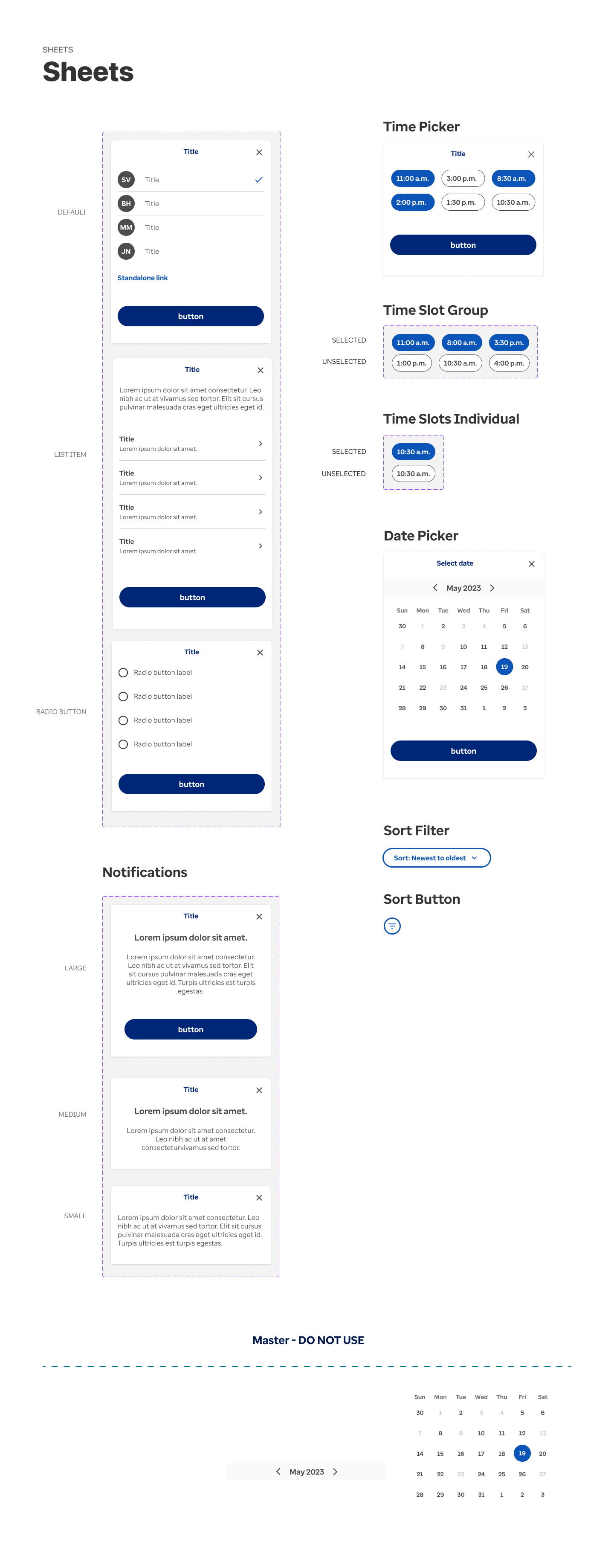
Mobile design system creation for rebrand project efficiency
Overview
With the oversight of a Principal Designer, I developed a mobile design system featuring a comprehensive set of pre-built components that were to be used in a product rebrand. This system streamlined the rebranding process by enabling designers to work more efficiently and reducing the need for UI design tasks.
| My Role: | UI Designer |
|---|---|
| Responsibilities | Mobile app audit, inventory planning, build responsive components, layout and labeling |
| Collaborators | Dir of UX, Sr UX Designer |
| Timeline | 3 weeks |
The Process
The Principal Designer and I conducted a comprehensive component audit across the entire app, identifying the most frequently used components and determining the necessary variants for each.
Considerations for the audit
- Who will be using the design system?
- What components exist and what do we need to make?
- How many variants do we need of the same component?
- Categorize all components.
- Build all components responsive and on brand.
- Keep layers structured with proper naming conventions that are consistent with code.
Example of a scalable component
Components were made scalable and reusable as much as possible saving repetitive work and elements in the collection.
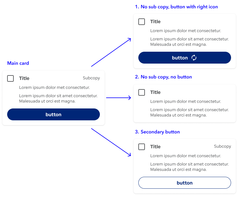
Example component - Using one card that can be changed to other varieties using the properties panel in Figma.
The end product
An entire mobile design system was produced and the was used by the mobile team. Further maintenance was performed requiring more components and updating current ones. Only a few selected sets of components are shown.
Sample of design system documentation
Project 3
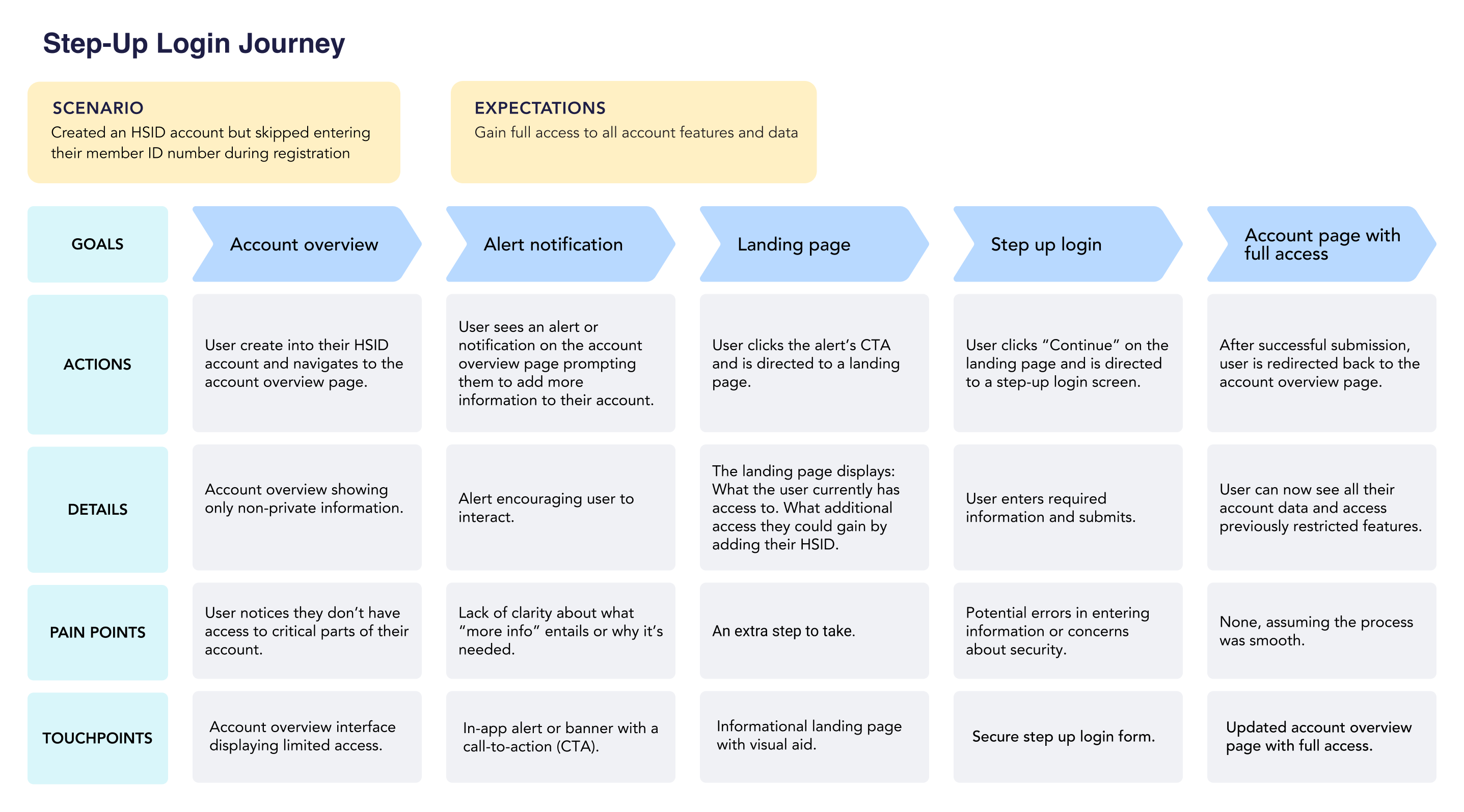
Designed possible solutions for HealthSafe ID step up flow for account upgrades
Overview
Reviewed business goals to design a login landing page experience that worked within engineering restraints and still created the best scenerio for the user. Collaborated on visual design page functionality with team.
| My Role: | UX Designer |
|---|---|
| Responsibilities | Clarify journey, find possible painpoints, built page elements, design landing page iterations |
| Collaborators | Dir of UX, Lead Designer |
| Timeline | 8 weeks |
The Problem
Users are given an option at account creation to enter their member ID or skip this step and do it later in the process. At some point, the user will need to revisit this step in order to view all of their private account features. Not completing this step is driving a high rate of support calls for customer assistance. Business wants to reduce this call volume by encouraging users to finished their account creation process.
Goals
Benefits of step up landing page experience:
- Reduces support call volume.
- Creates an incentive for users to complete the account creation process.
- Improves security with identity verification.
- Increase user comfort having access to private information.
The Challenge
How can we create an interesting landing page experience that encourages the user to step up their account?
Research
After getting briefed on progress so far, I made a journey map to help me understand the user flow and possible pain points that would help uncover opportunities for improvement.
The first design idea
The design idea was an area for the id number to be entered and a pleasing graphic to the right. In addition, a section to show the user what they could have access to if they were to complete the account creation process. This area would be dynamically generated according each users account.
Pain points and feedback
- According to assumptions made, by the product team, users may feel uncomfortable entering their ID number in a landing page interface that didn't look like a traditional login screen. It questioned their trust and security.
- Is the hero graphic necessary? Do we need so much eye catching elements to attract the user?
- Will the landing page be able to dynamically populate what the users will have access to?
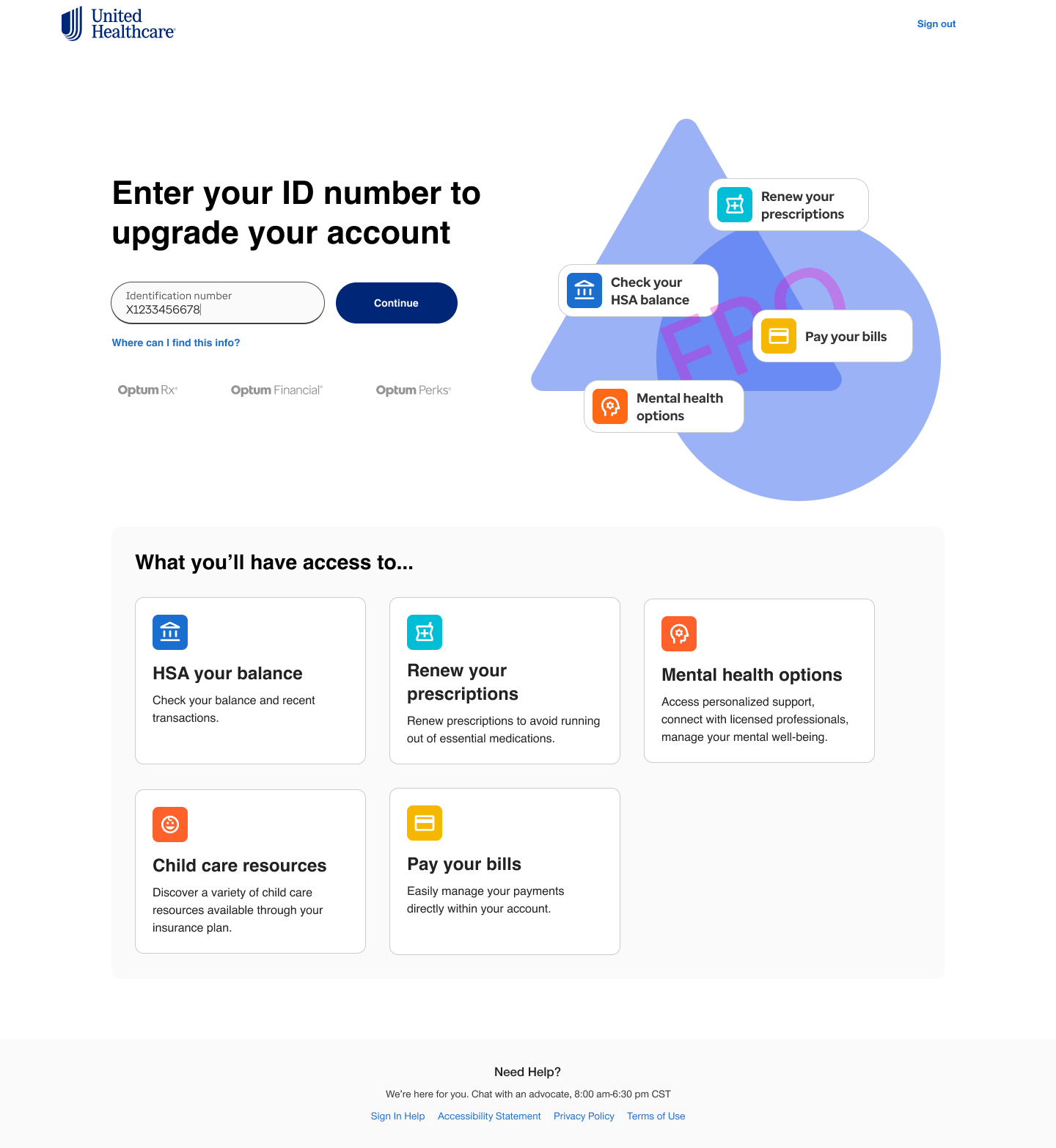
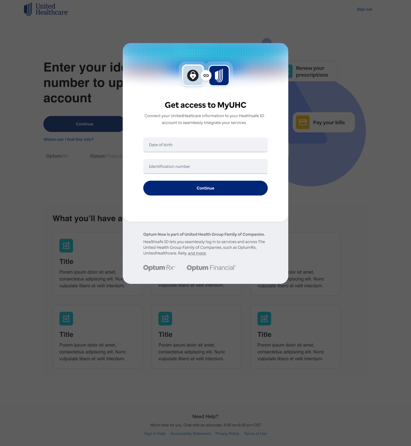
Early iteration with input field and cta on landing page.
Iterations
After meeting with the team, we decided to eliminate the login component from the landing page and replaced with a continue CTA. This led user to a login modal which enhanced the feeling of privacy and familiarity. This created an extra step, but benefited the user experience.
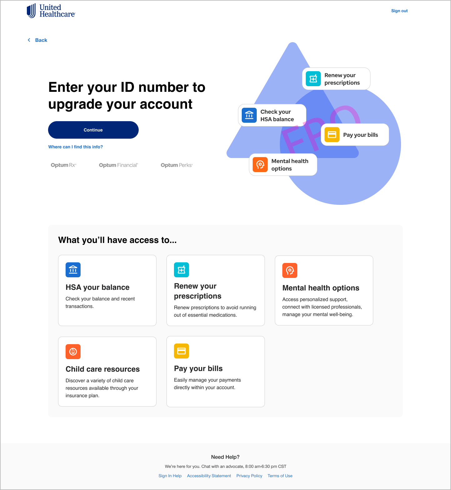
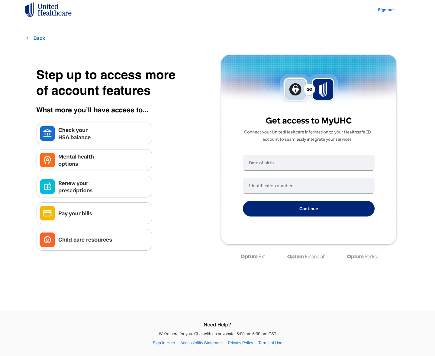
Step up page with input field removed leaving just the cta button that will bring the user to the login screen.
A traditional and familiar sign-in form was added replace the form field in the previous iteration.
The Solution
After reviewing the wireframes with the team, we brainstormed more ideas on how to make this process as simple and secure as possible while enticing the user to interact, work within thie constraints of engineering, and still meeting business requirements. The final solution had the following changes.
- Minimized clutter by only showing what more the user will have access to.
- User would find this page trusting due to the familiar login experience.
- Keep everything on the same page eliminates unnecessary steps.
- Scalable, clean design that is easy to manage.
- Sticks to brand.
Final - Step up landing page with login.
Project 4
Discussing design strategy for Optum One MVP dashboard
Overview
I discussed strategy with cross-functional teams and planned the funcionality and engineering limitations of a would-be dashboard for the MVP product Optum One. Produced components and assets that aligned with the needs and changes of the product discovery.
| My Role: | UX Designer |
|---|---|
| Responsibilities | Strategy, cross-team collaboration, responsive design, build mock ups, decide navigation, component production |
| Collaborators | Dir of UX, Sr UX Designers, Engineers, Product Lead |
| Timeline | 3 months |
The Problem
Optum has a wide variety of products that put the user in the position of creating accounts and logging into each of the them to view their account information. This creates a lot of excess time for the user to navigate around all their accounts and puts a strain on the business call centers. Business wants an all-in-one product dashboard that links the popular features of each products together in one interactive space.
Goals
- Increase user engagement by keeping users active longer by housing their most-used features in one accessible location.
- Reduce churn and improve retention by eliminating the friction of switching between multiple products.
- Boost user productivity by enabling faster task completion by eliminating switching between different interfaces
Pain points
- Too many of the feature capabilities could not be used outside of their parent platform. Optum products were not built to work together and could only be used on their own platform.
- Dashboard widgets couldn't be synced together. Plus, the team would have to manually make updates to the UI every time there was a change in the other platforms.
- Medicine cabinet couldn't track shipping.
- Bank couldn't carry over account totals.
- Most activiities planned for the page was not possible.
- Without the functionality, it was just ad space.
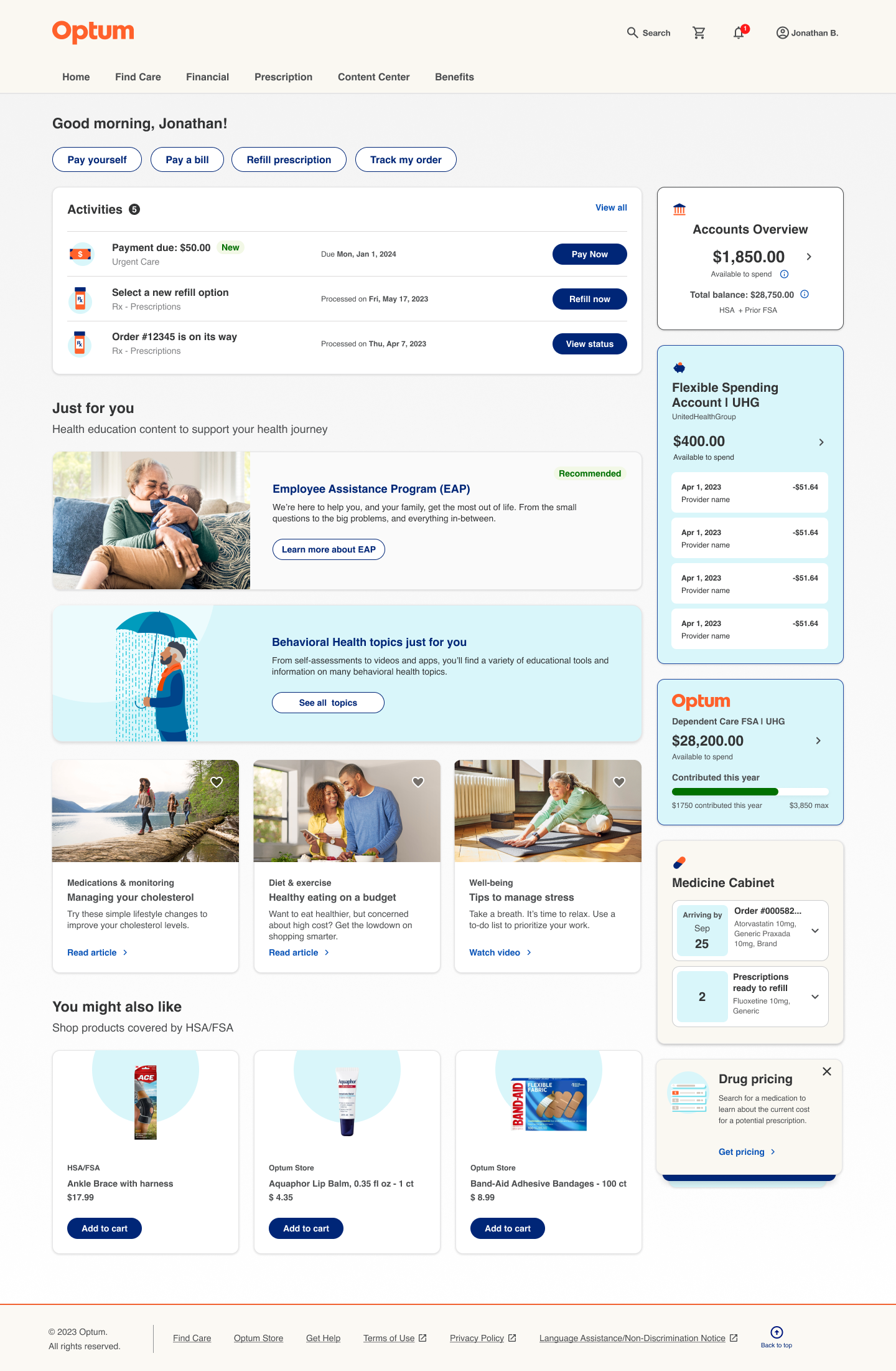
Early iteration of dashboard
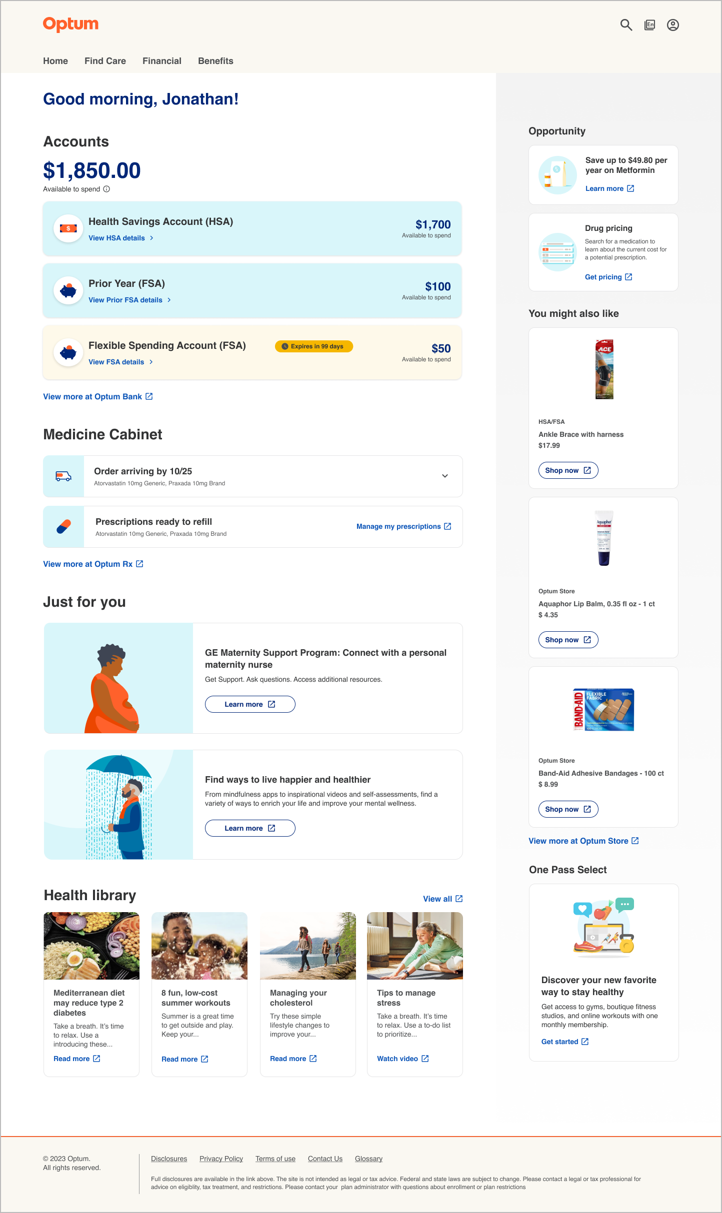
Later iteration of dashboard.
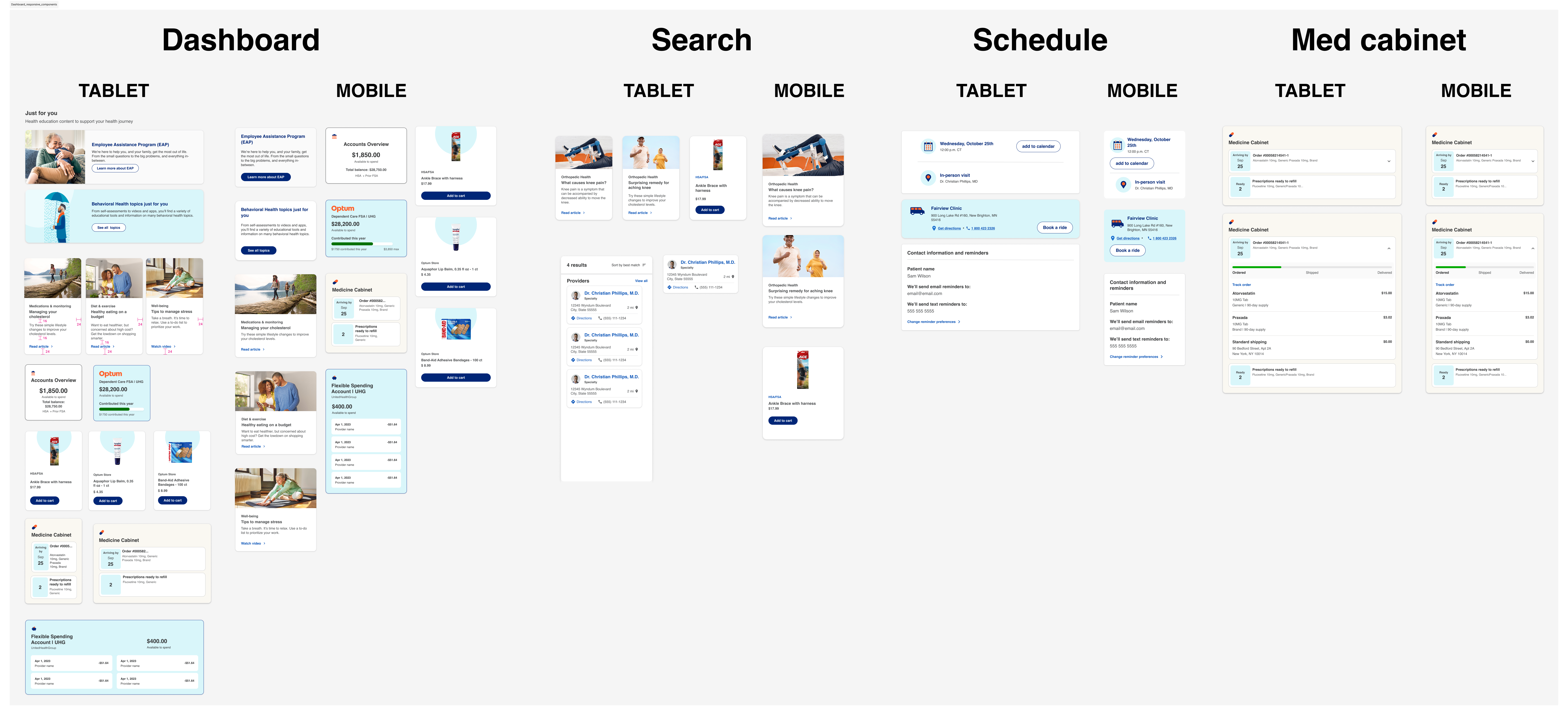
Dashboard responsive components
Takeaways
The project was eventually discontinued due to lack of technical capabilities. Design brainstorming was done ahead of exploring the technical limitations and this affected the outcome.
Let's Connect