TicketGig
Designed an end to end app that enables peer-to-peer buying and selling of mobile concert tickets, with an auction feature for a faux client as part of a class project.
Designed an end to end app that enables peer-to-peer buying and selling of mobile concert tickets, with an auction feature for a faux client as part of a class project.
TicketGig is a live entertainment ticketing and distribution company. They provide ticket sales, marketing, and distribution. They want a mobile app with features that will set them apart from their competitors.
Conducted research, product strategy and ideation, user interviews, information architecture, built wireframes and prototypes, performed user testing
DesignLab
Figma
Finding affordable concert tickets is becoming more difficult. TicketGig needs solution that allows individuals to buy and sell concert tickets while bypassing brokers and interacting directly with each other. Eliminating unnecessary fees and putting a cap on the selling price to be more affordable would increase attendance at events and keep the playing field fair.
How do we design an end-to-end mobile app for Ticketgig that brings a new service to their users get ahead of their competitors?
Through guided interviews, I was able to determine what needs and expectations. I analyzed users past experiences with ticket buying programs to identify successes and failures to inform my design strategy.
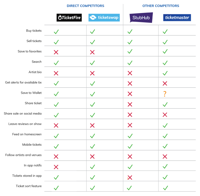
Looking into the competitors allowed me to compare their features, so I could better understand what are most popular and what I could do to make TicketGig unique.
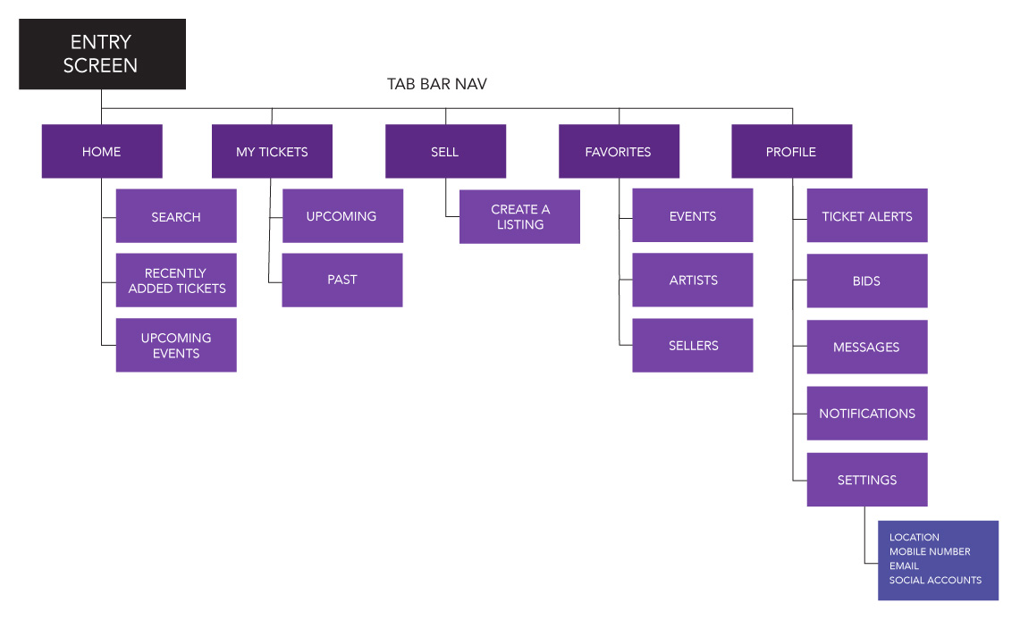
I structured the navigation to align with insights from my research, prioritizing what would be the most frequently used features in the application.
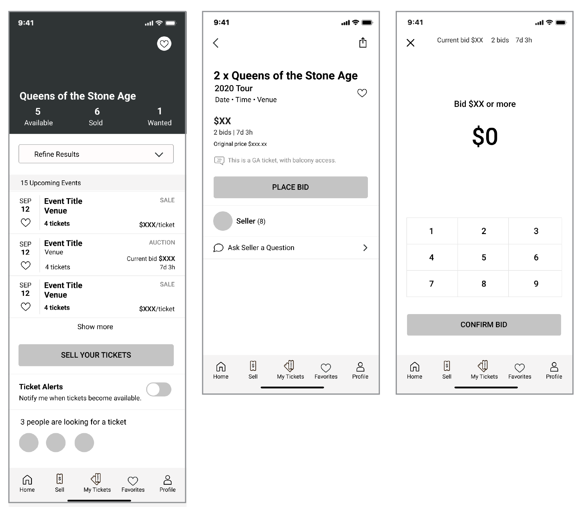
The first round of ideas, exploring layouts and hierarchy. I want consistency and repeated patterns. A simple and clear user experience, so the user won't hesitate and think about how to move forward. This also inspired my UI. How do I make the list items consistent across the app?
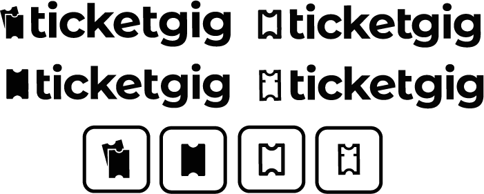
The look and feel of the product was to relate to concert going audiences of of all ages, but still cutting-edge enough for the trendy music business. Clean with a simple icon to quickly identify what the app is about and to differentiate it from it's competitors.
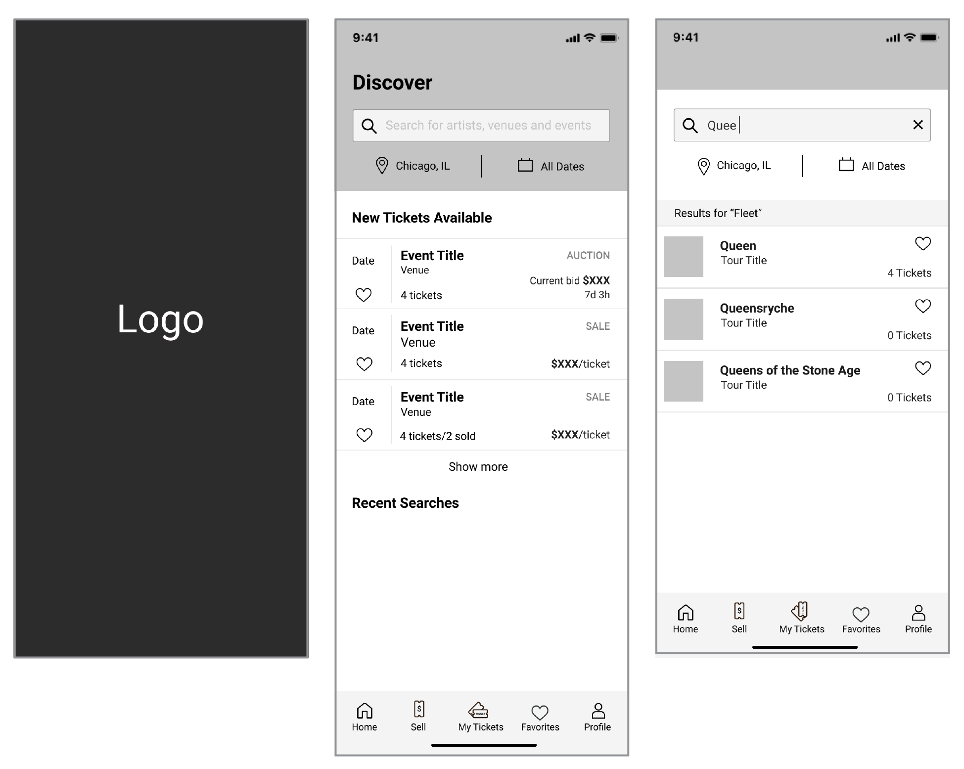
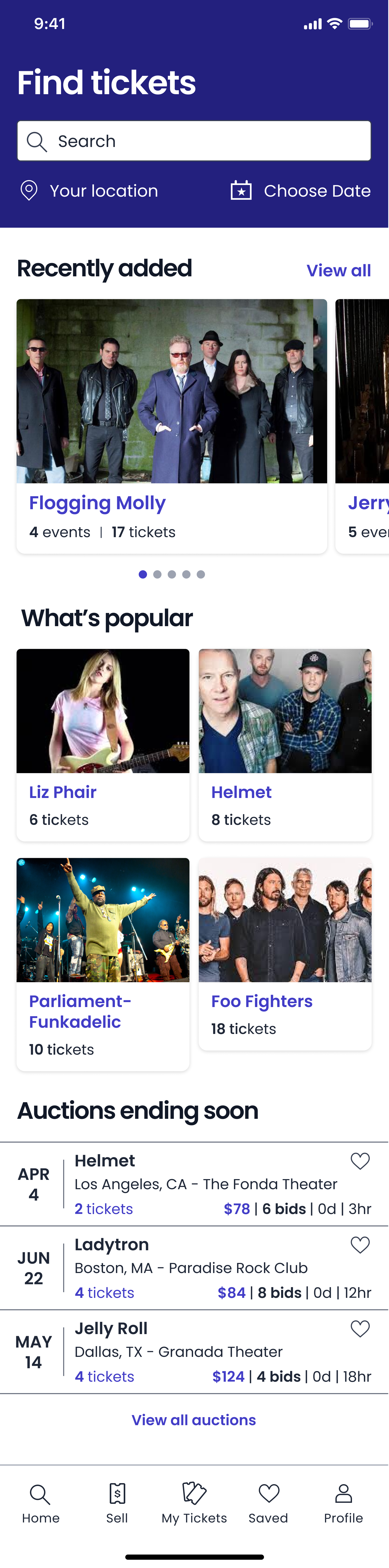
Home screen

Landing screen
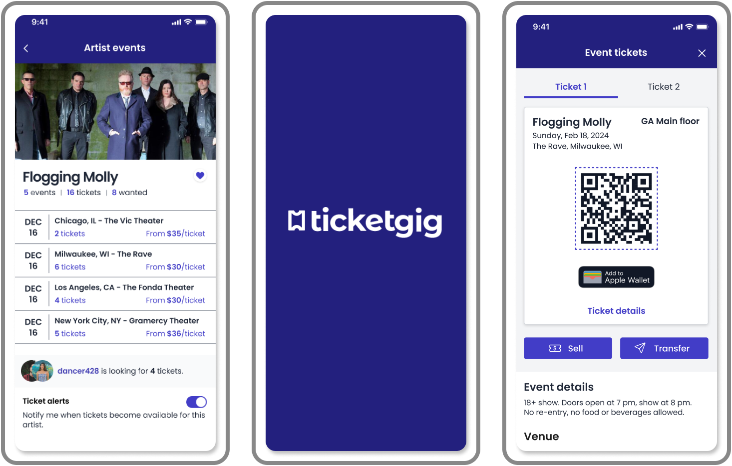
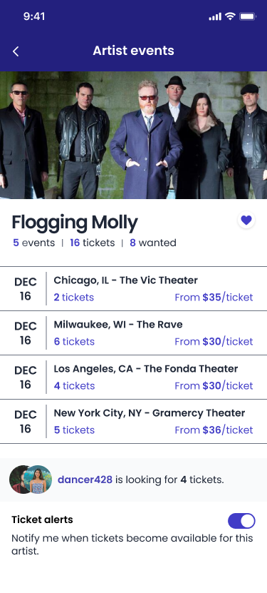
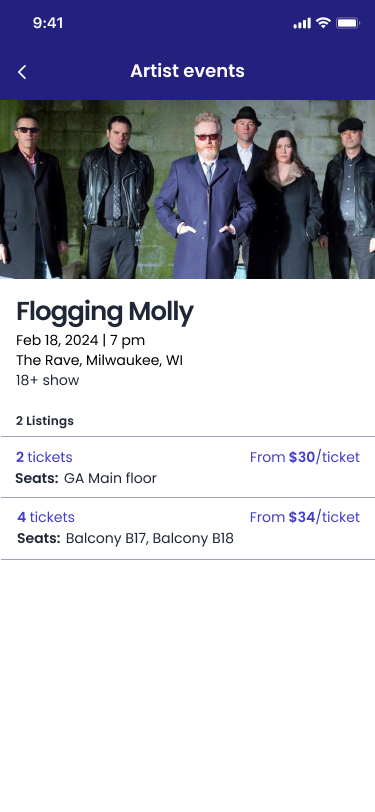
Artist events page
Ticket purchase
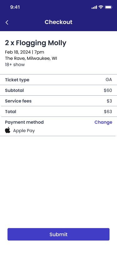
Checkout
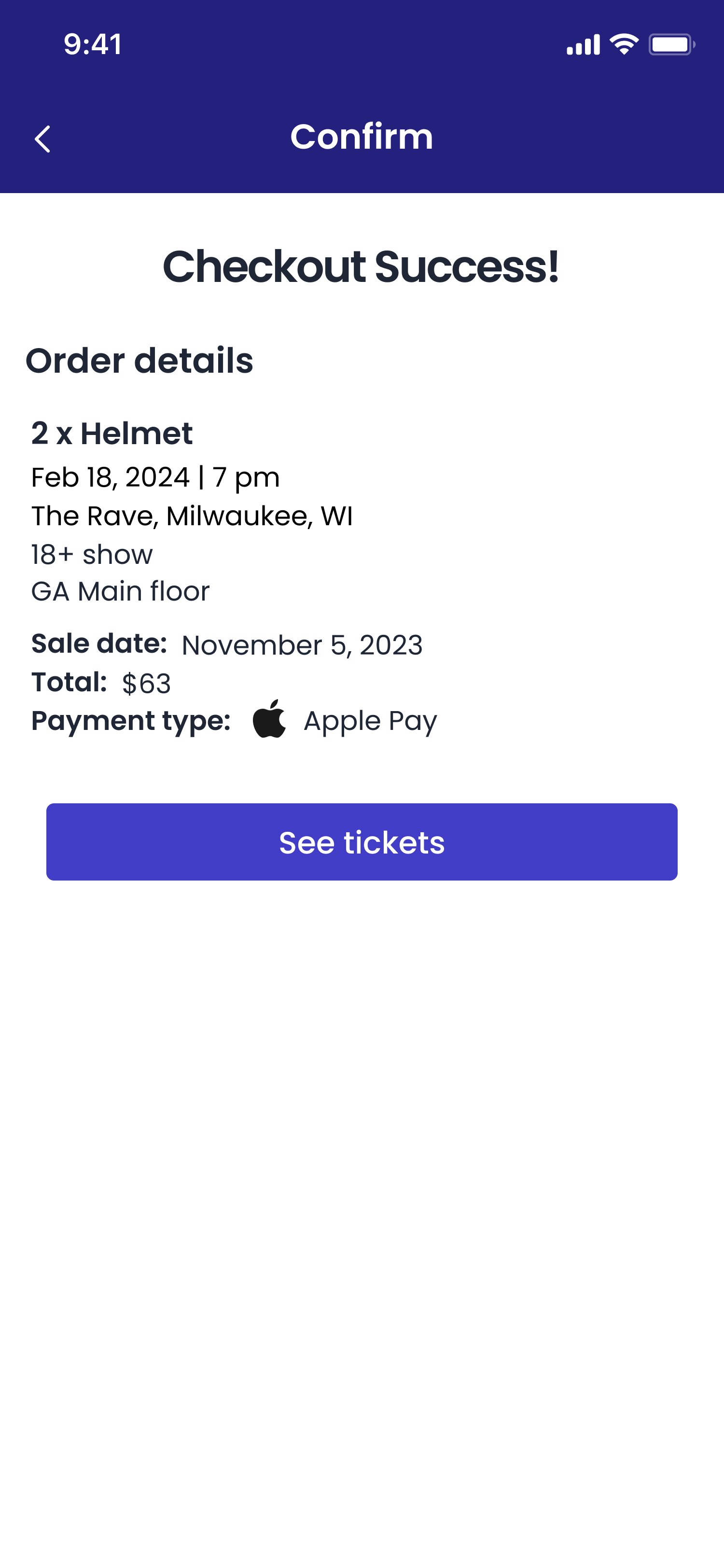
Checkout confirm
Ticket
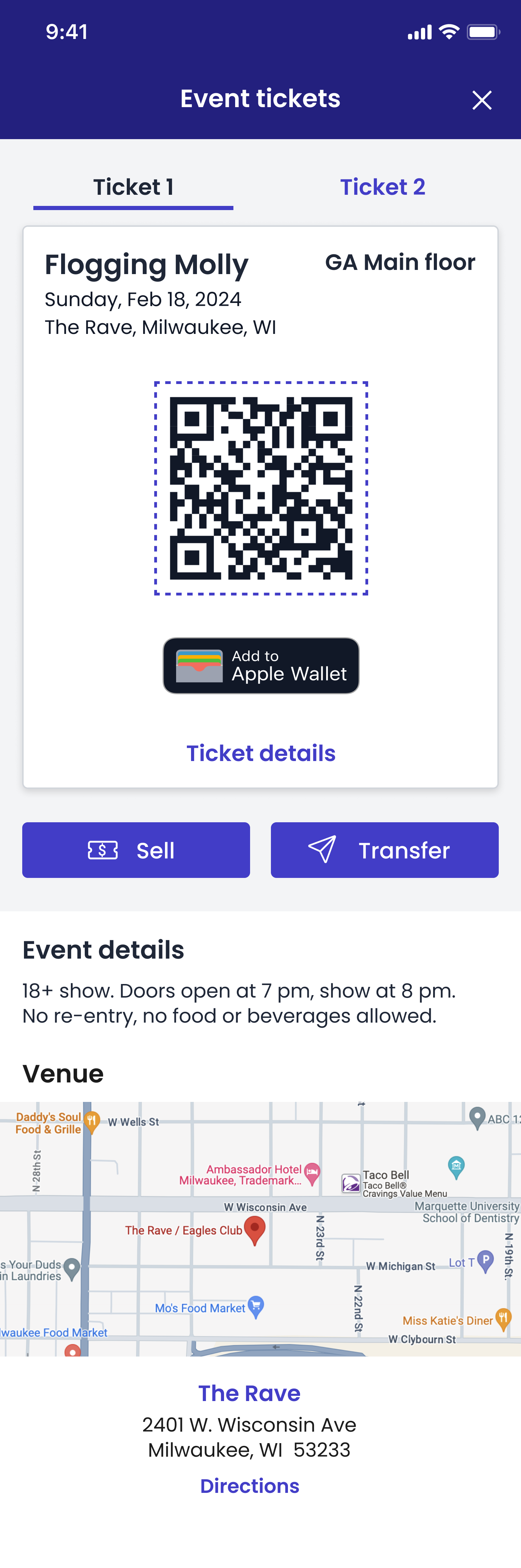
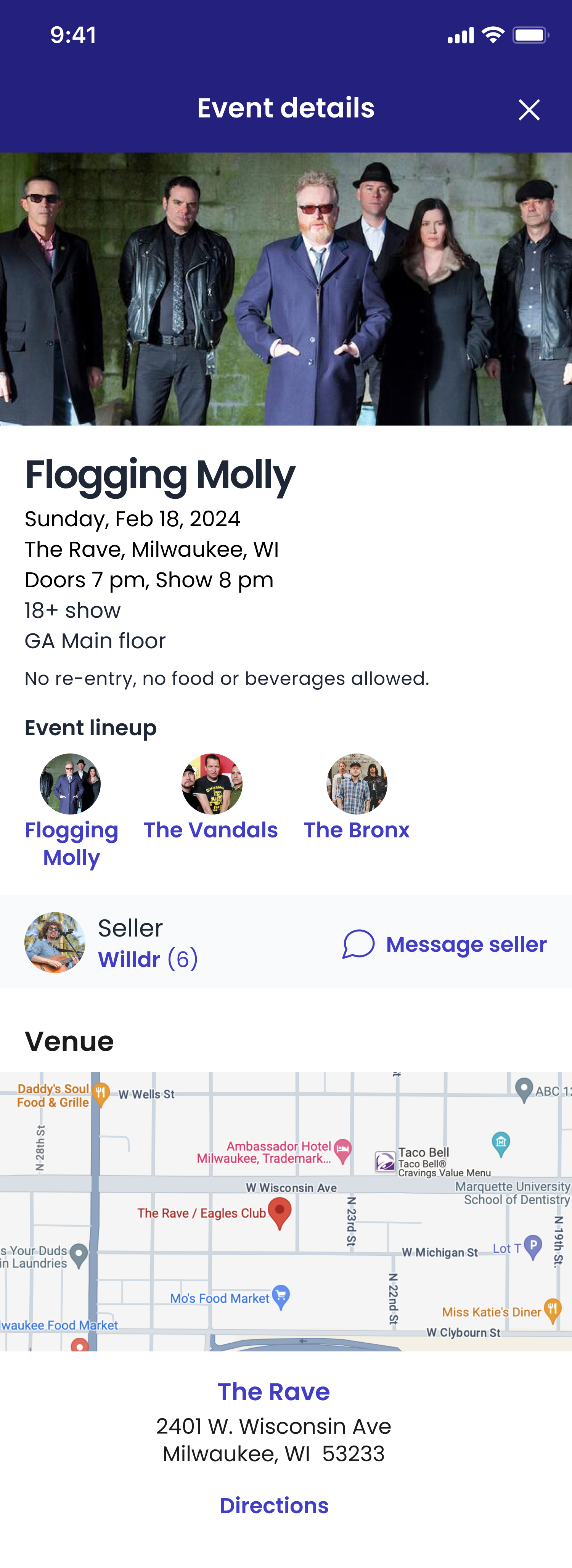
Event details
Moving forward, I will revisit some of the pain points users found while testing to further improve the product usability and continue to test as needed. I may add some of the nice-to-have features that would add to the quality of the product.
By creating a simple solution for a complex app, I was able to push my own boundaries in both research and design, keeping in mind the users' needs and the developers' job in the process.
Let's Connect