Project 1
Reimagine the MyOptum landing page to adhere to brand
Overview
Optum wanted a redesign of the MyOptum desktop product to align with their brand and other products. I collected landing pages from four Optum products for inspiration and branding ideas. After reviewing the current design and content, I identified improvements to enhance user experience while meeting company requirements.
| Responsibilities | Layout design, research other products, build mockups, review with team |
|---|---|
| Collaborators | Dir of UX, Sr UX Designer |
| Tools | Figma |
The Solution
The changes I implimented from the original design.
- Replaced top nav with branded nav.
- Designed a hero section that was more inline with the rest of Optum products and added a branded sign in.
- Replaced the the top paragraph into cards provided an simpilar and pleasing way for the user to absorb the information as opposed to just reading a paragraph.
- Health library stayed the same because it is dynamically generated from another product and can't be changed.
- Optional content that could be switched out for something different.
- Footer replaced with branded footer.
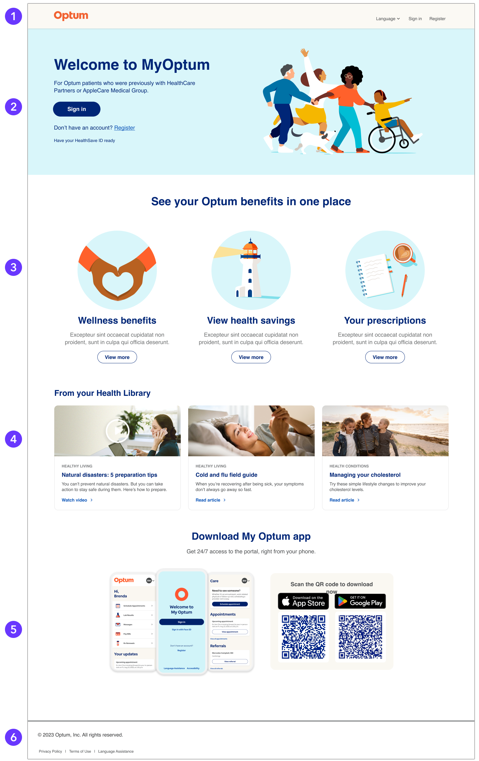
My Optum landing page redesign idea
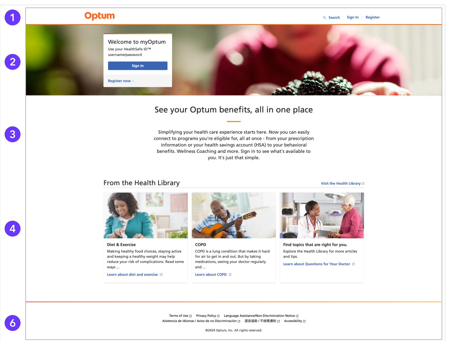
My Optum original landing page
Project 2
Website redesign ideas for Blue Sky+ to improve audience engagement
Overview
I met with the team to discuss their brand's desired look and feel. They wanted a brighter, friendlier design to attract users, preferring a lighter blue over their darker brand blue. After reviewing their current site and researching successful competitors, I created some mockup ideas.
| Responsibilities | Competitive research, collaborate on aesthetics, layout design, build mockups, moodboard creation, design consulting |
|---|---|
| Collaborators | Lead FED, CEO, Marketing Director |
| Tools | Figma, Photoshop |
Goals
- Update with current branding.
- Re-establish look and feel to something more energetic and possitive.
- Keep most of the content the same.
- Stay within the current format as much as possible to minimize development time.
- Attract user engagement.
- Define a simpler aesthetic.
The Solution
Upon consulting with the team and reviewing design iterations, several improvements were made.
- The addition of a sky-blue palette brought the site closer to the brand's identity and gave it a brighter and lighter feel .
- The inclusion of icons on the offer cards added more visual distinction to the space.
- Video remained but was repositioned to occupy the space more effectively.
- The form field was moved to the bottom, aligning with the standard placement of forms.
- A more standardized footer was put in place.
- An overall clean and cheerful look was created to attract users to engage with the website.
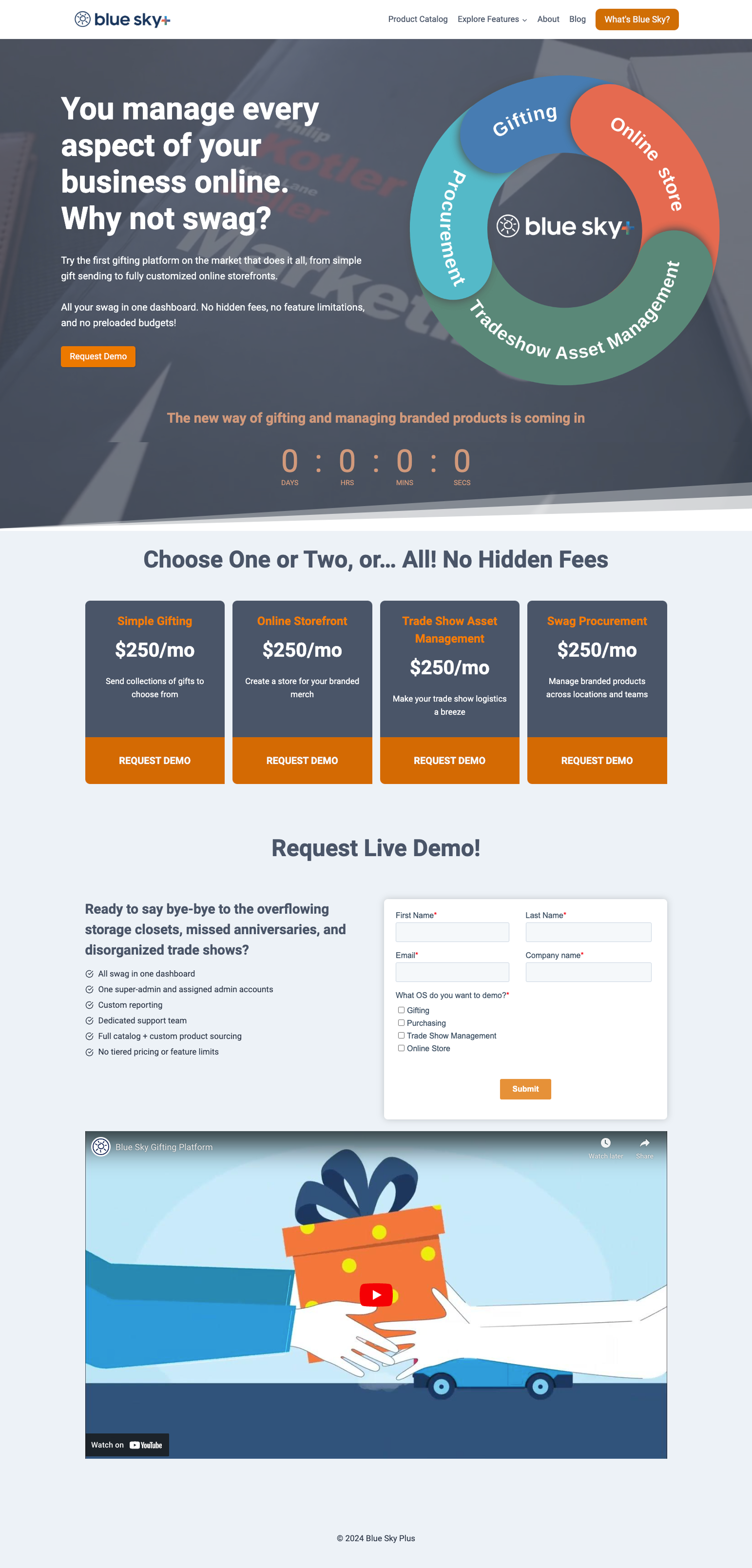
Blue Sky+ original homepage.
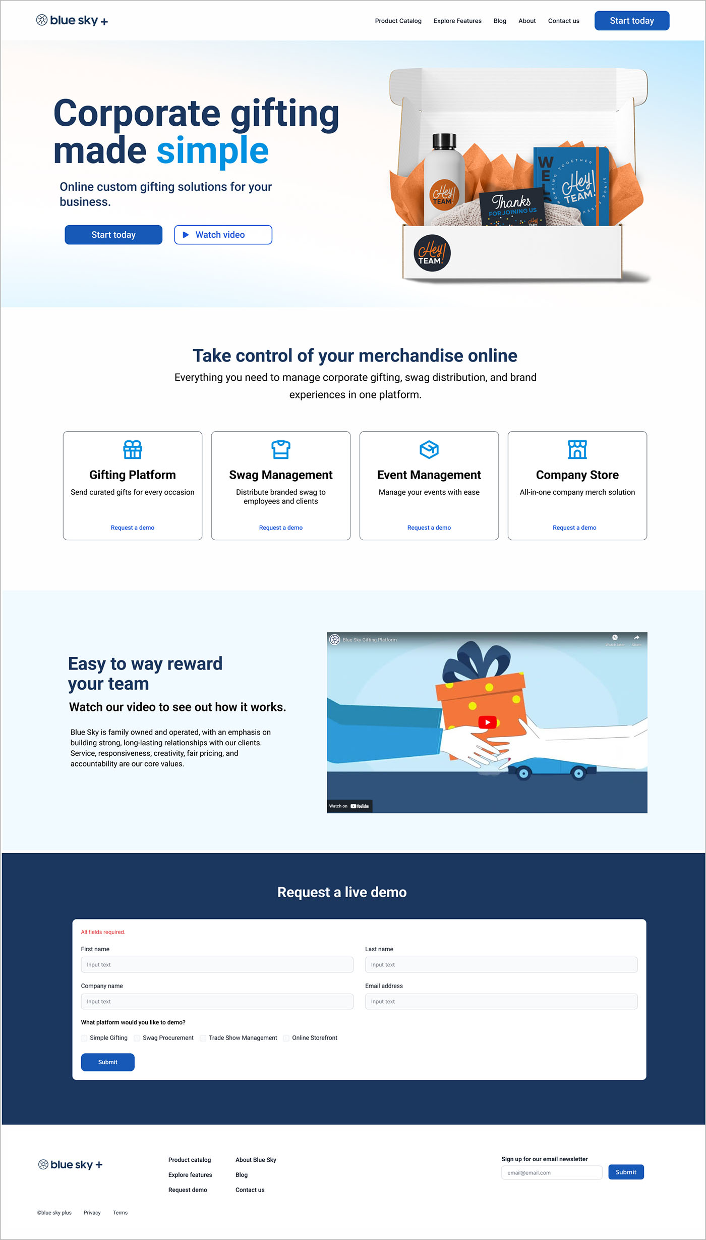
Blue Sky+ redesign homepage.
Redesign moodboard
Project 3
Design a wellness website for a faux client
Overview
Move Wellness is a faux wellness studio that offers yoga classes, acupunture, massage and meditation circles. Completed a full end-to end website starting with user research, design sketches, wireframes, and branding.
| Responsibilities | Competetive research, layout design, wireframes, prototype, logo design, branding |
|---|---|
| Tools | Sketch, Photoshop, Illustrator |
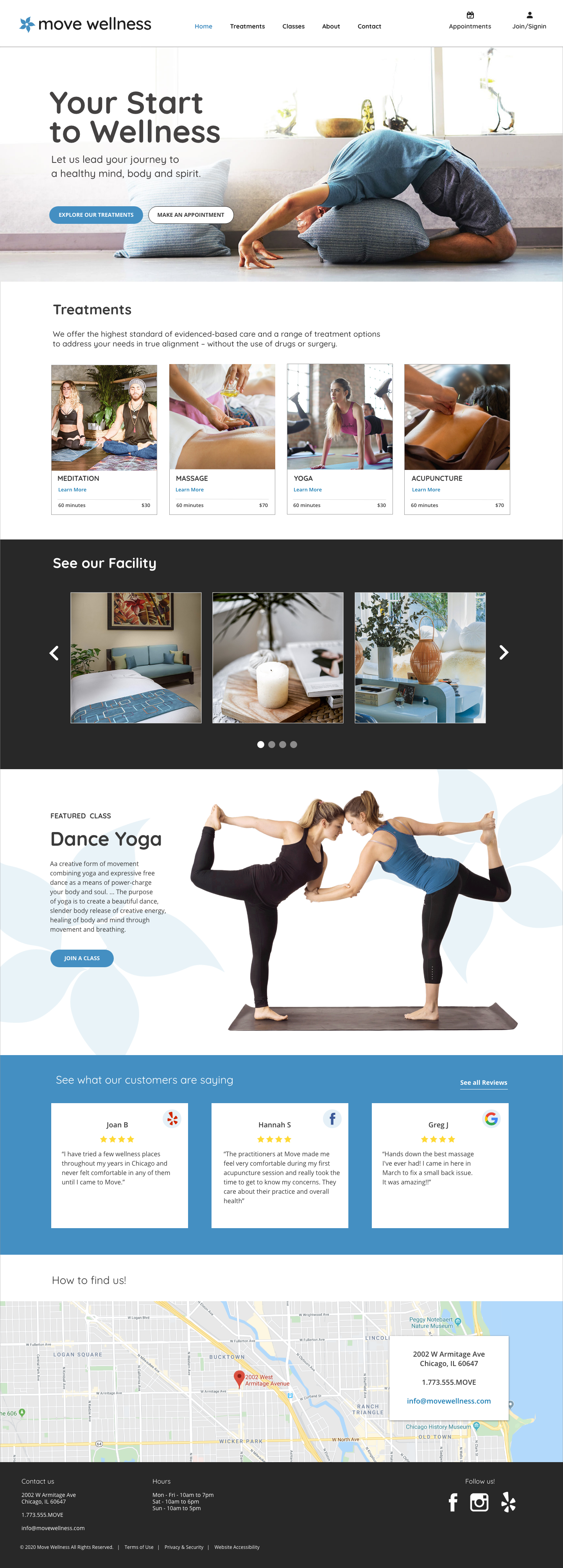
Move Wellness homepage
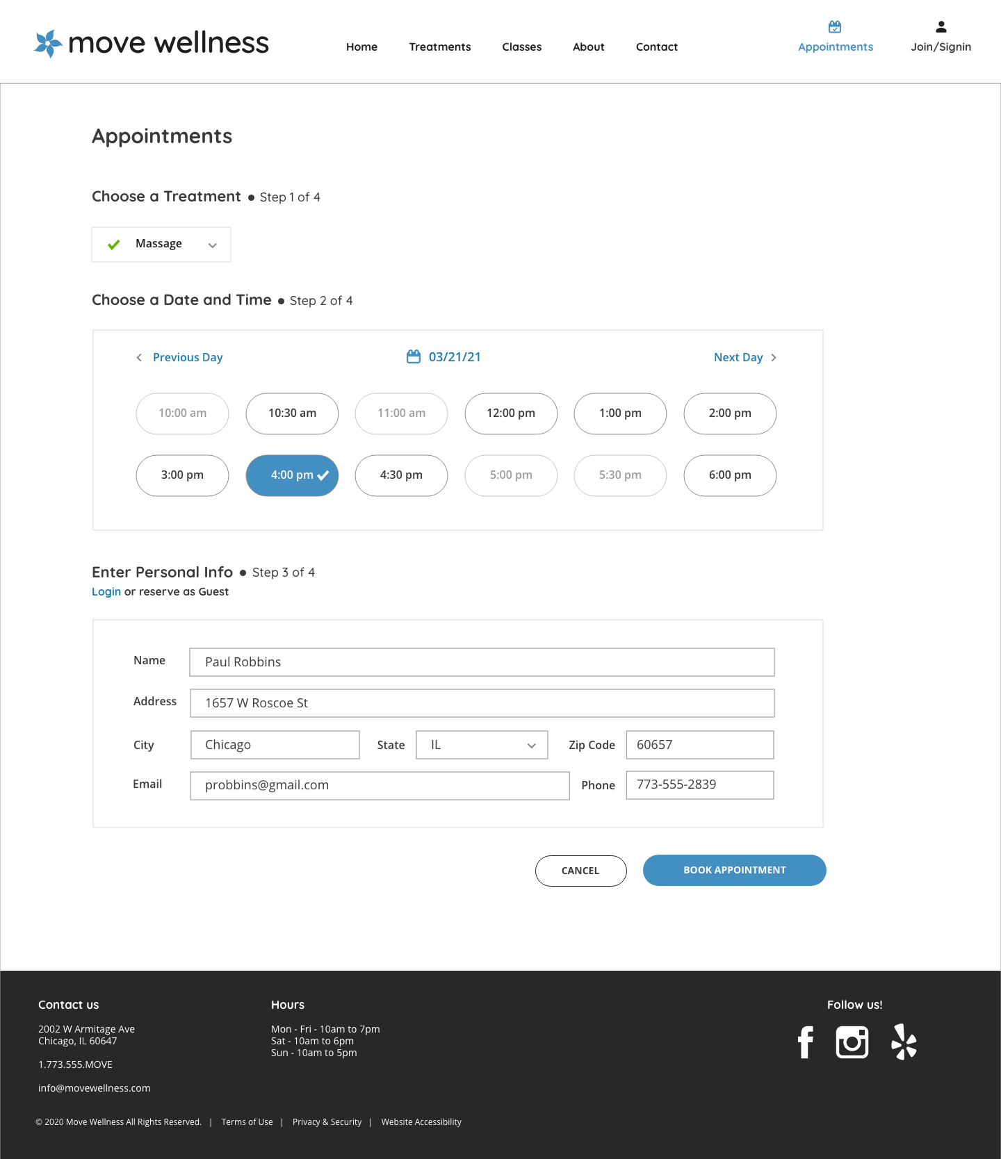
Appointment form filled
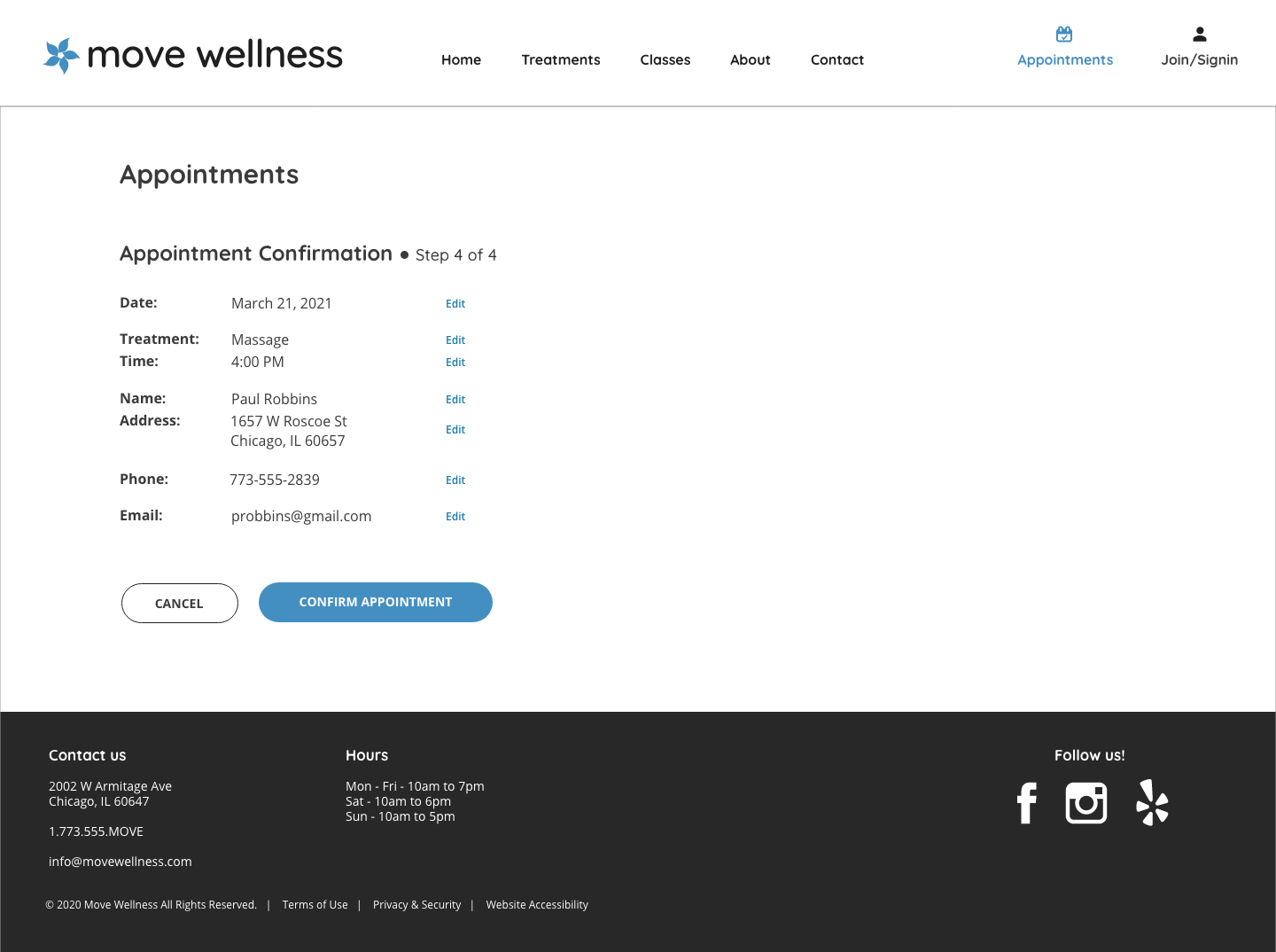
Appointment confirmation
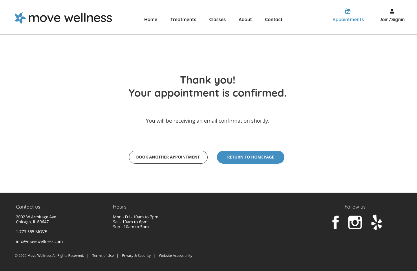
Thank you appointment confirmed
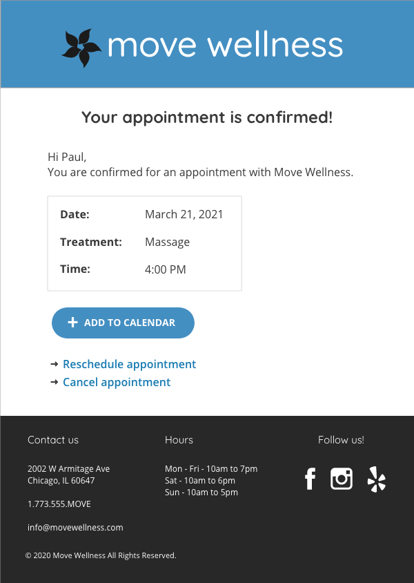
Confirmation email
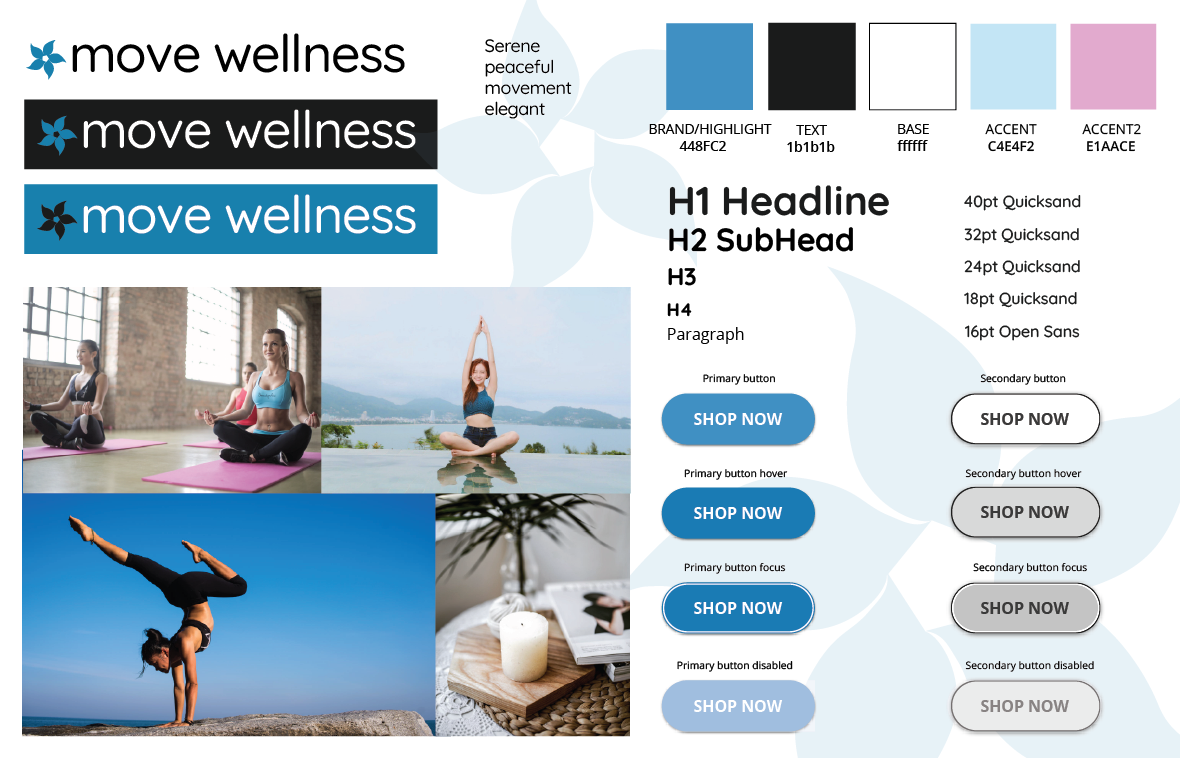
Move Wellness style tile
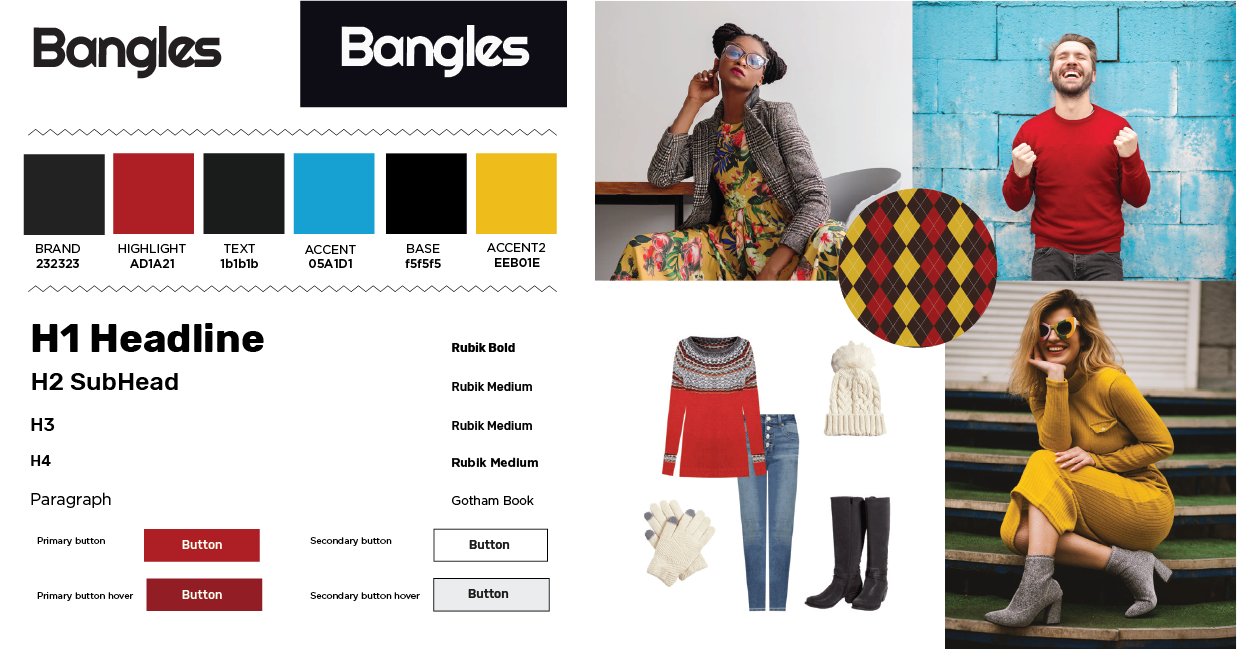
Project 4
Design a retail website for a faux retail outlet
Overview
Designed interface and branding for faux retail clothing client called Bangles. Completed a full end-to end website starting with user research, design sketches, low-fidelity and high-fidelity wireframes, logo design.
| Responsibilities | Competitive research, layout design, wireframes, prototype, logo design, branding |
|---|---|
| Tools | Adobe XD, Photoshop |
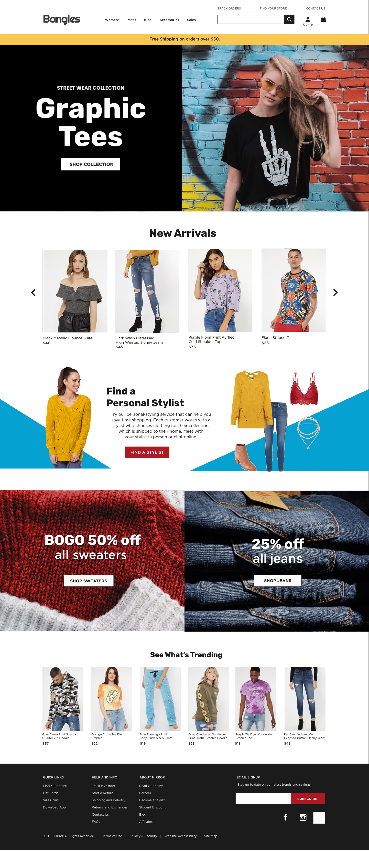
Bangles homepage
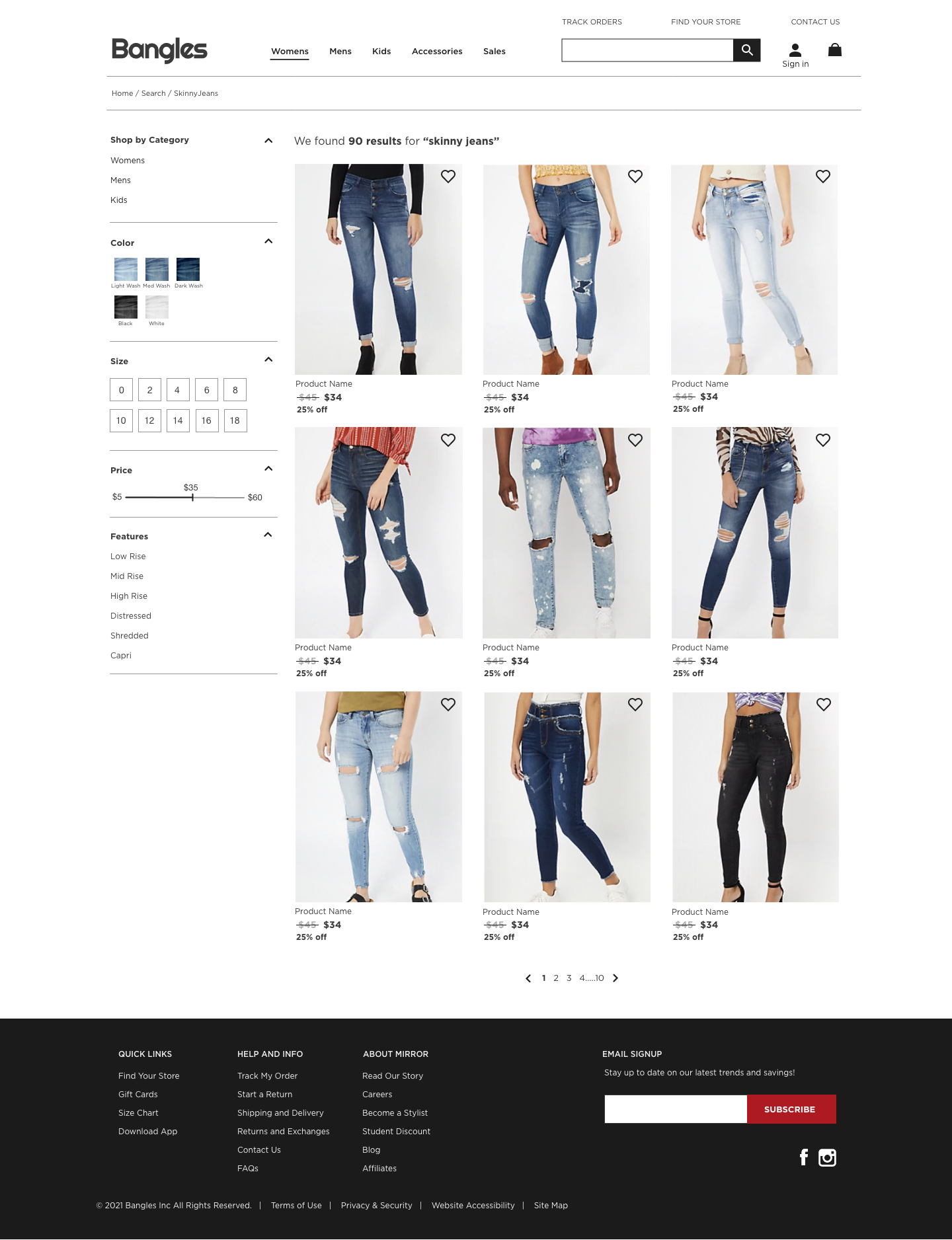
Search results
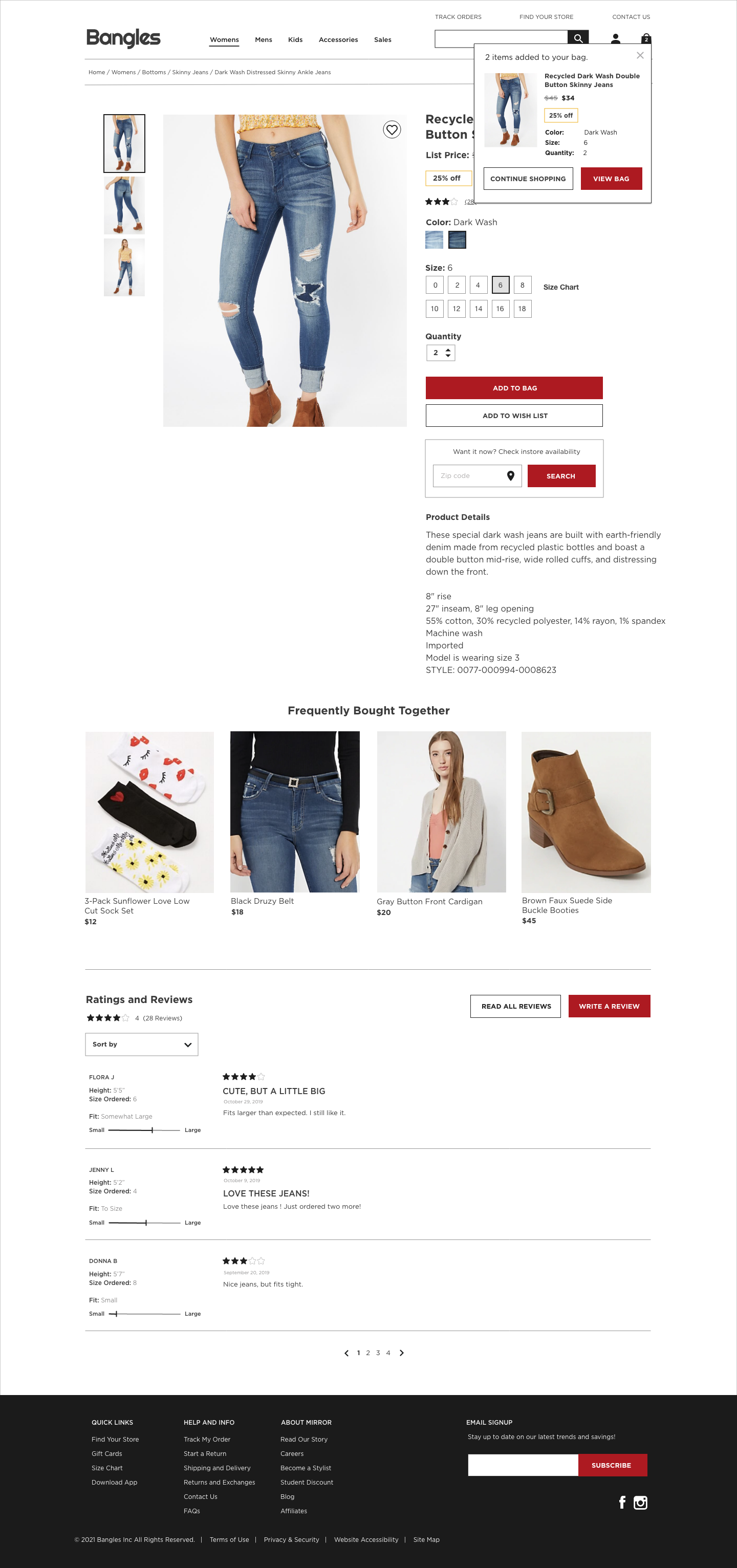
Product page with shopping bag open
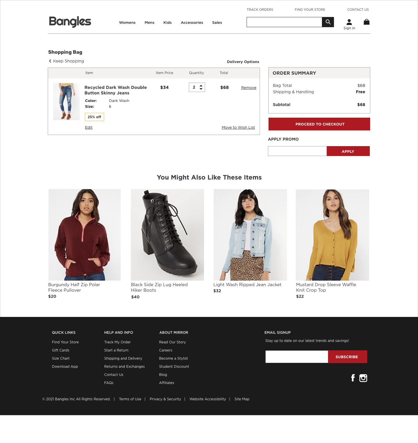
Shopping bag
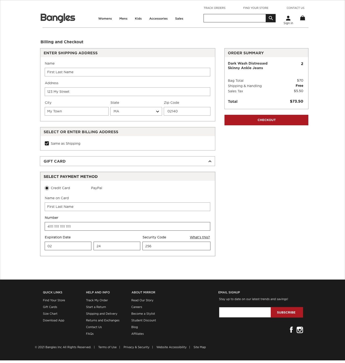
Checkout filled with order summary
Let's Connect