Mobile Design System
Mobile design system creation for rebrand project efficiency
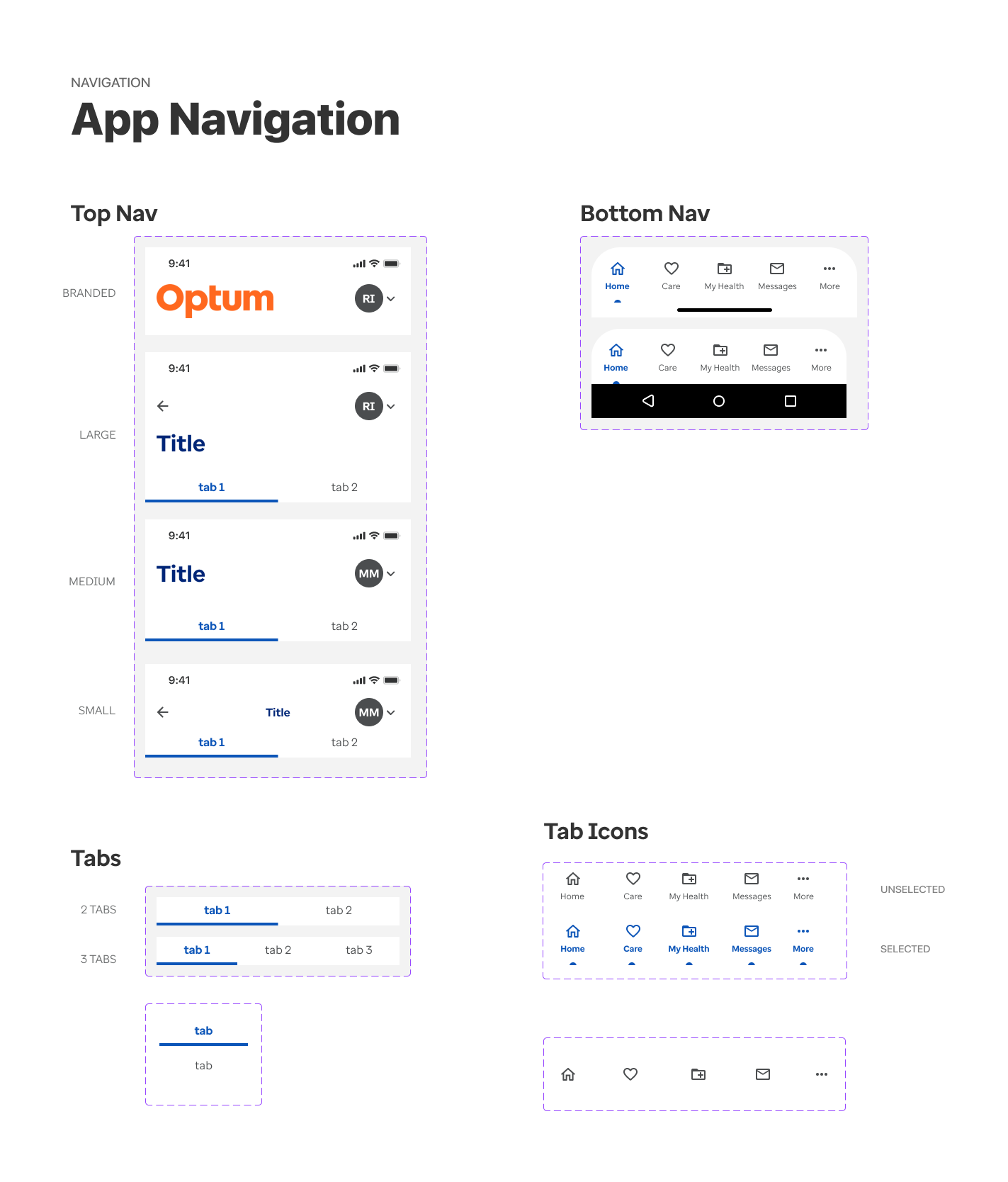
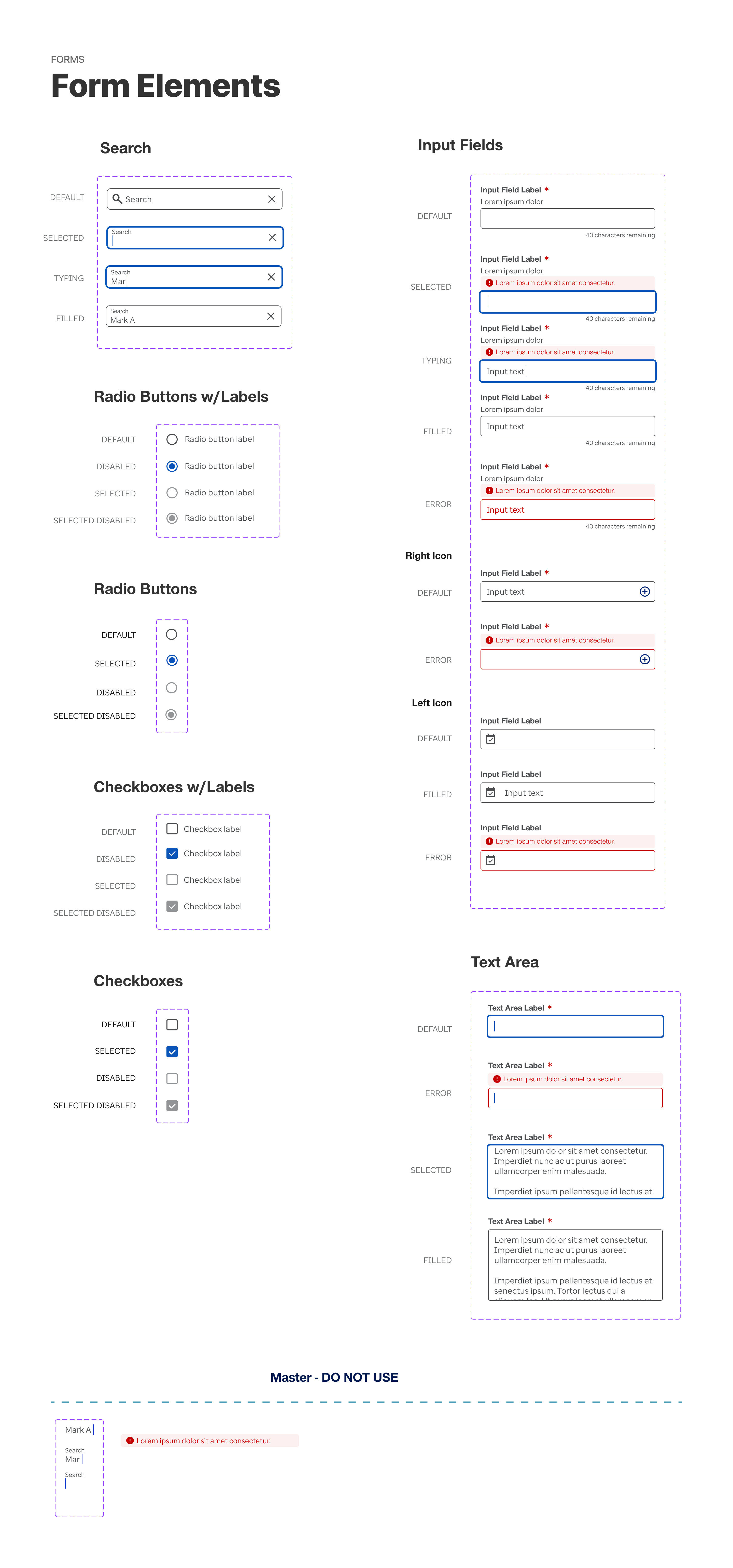
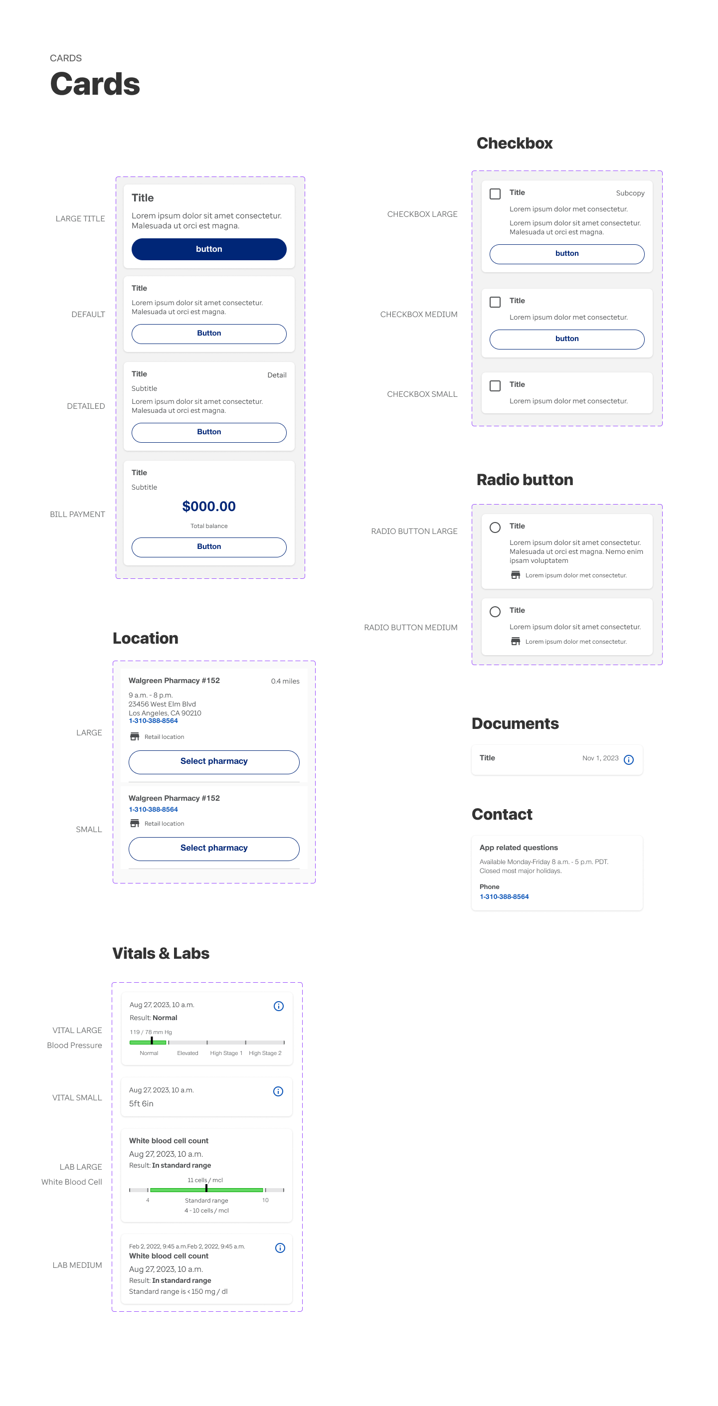
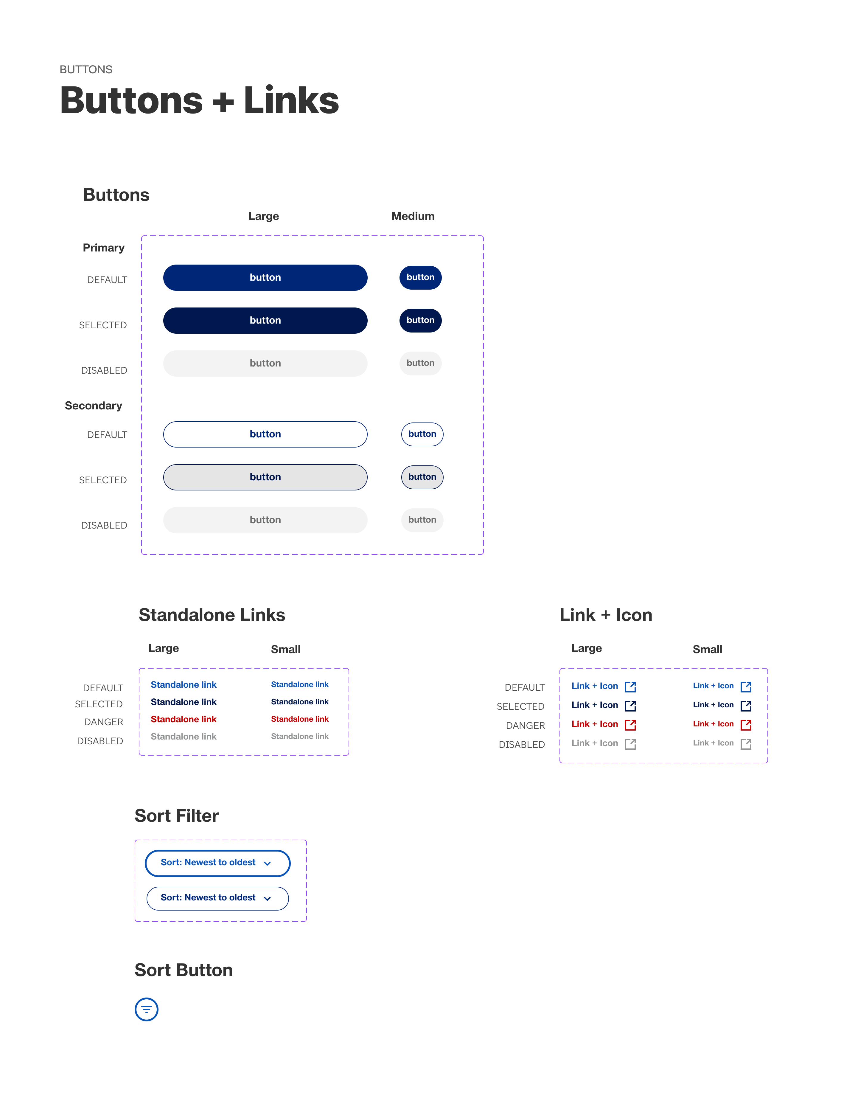
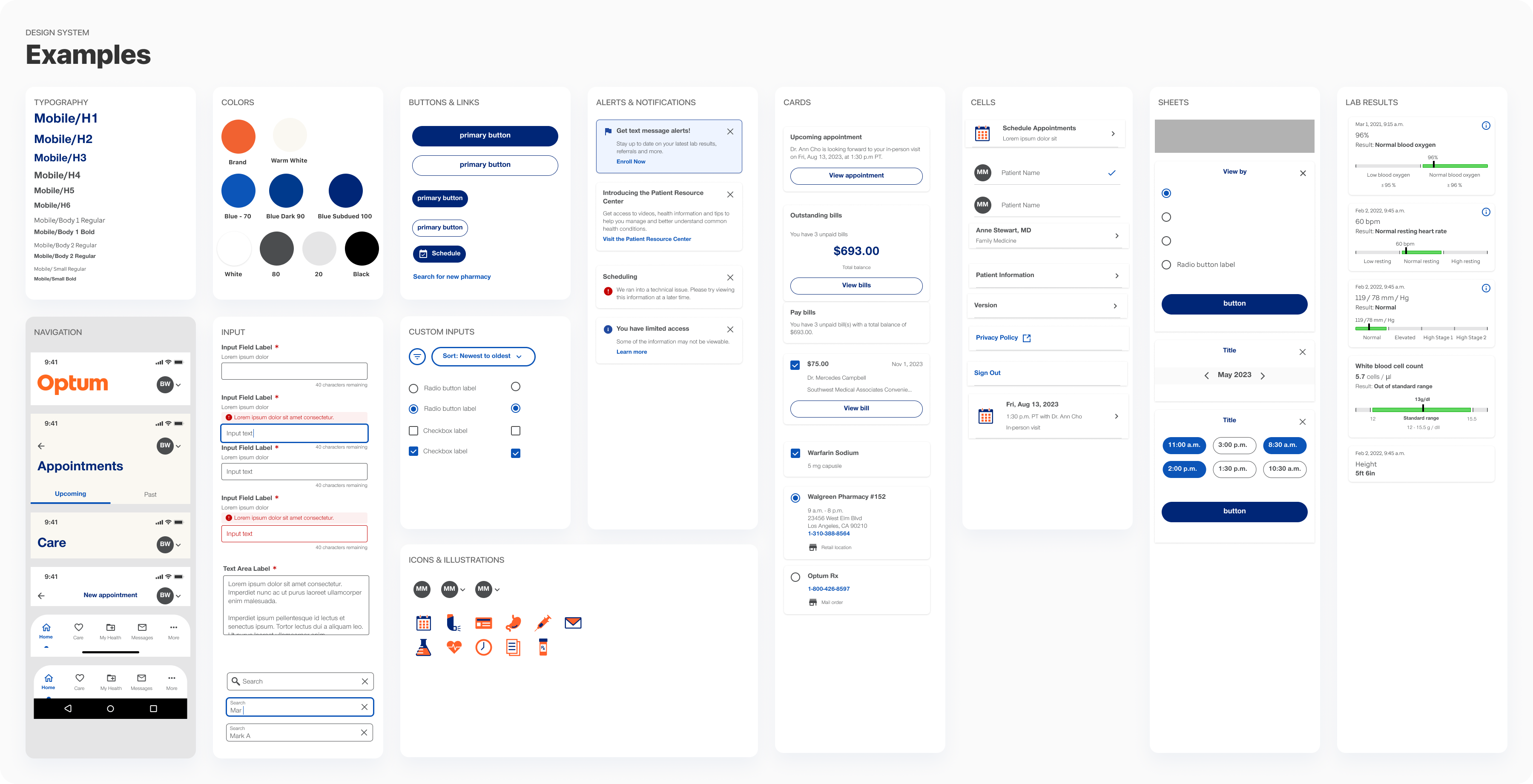
I developed a mobile design system featuring a comprehensive set of components that were to be used to rebrand Optum Patient Portal Mobile app. This system streamlined the rebranding process by enabling designers to work more efficiently and reducing the need for UI design tasks.
The project was kicked-off with the Principal UX Designer who gave me the initial directions and then let me manage the project to the end. There were check-in meetings along with way.
Constraints
Component features and functionality could not be changed. The goal was to rebrand the current assets to reuse in the Patient Portal product.
The Process
- Gathered all the components for an audit
- Listed components that needed to be rebuild and rebranded
- Rebuilt components using autolayout and variants in native mobile format
- Reviewed for accuracy and consistancy
- Populated the the app with new components
- Maintained system after completion
Project information
- Collaborators: Principal UX Designer
- Client: Optum
- Tools: Figma
- Role: Understood existing mobile product, performed audit, built mobile components, maintained system
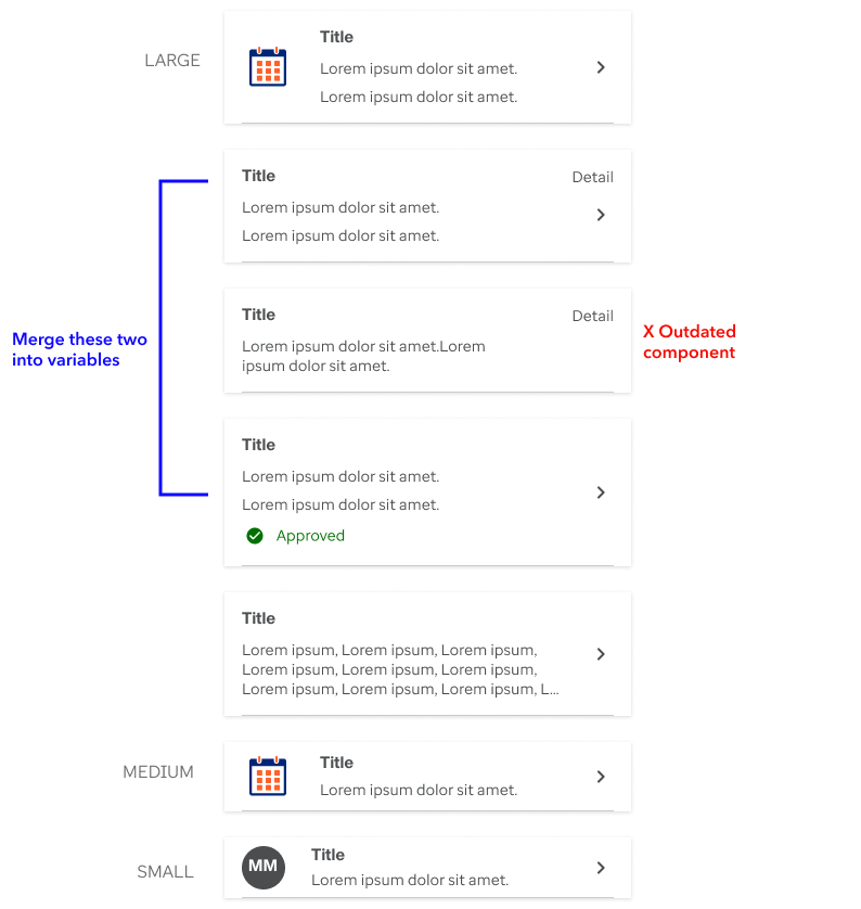
Collection of list items for audit
Considerations for the audit
- Who will be using the design system?
- What components exist and what do we need to make?
- How many variants do we need of the same component?
- Categorize all components.
- Build all components responsive and on brand.
- Keep layers structured with proper naming conventions that are consistent with code.
An example of component audit was to gather the different components in each category that were currently in use and decide how many we needed for the rebrand and how many we could dismiss or merge together in variables.
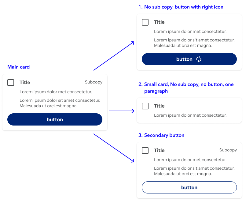
Example of a scalable component
All components were built using Figma best practices of auto layout and variants and tested for A11y and responsiveness. They were made scalable and reusable as much as possible saving repetitive work and elements in the collection. Layers were named accordingly, to make development easier.
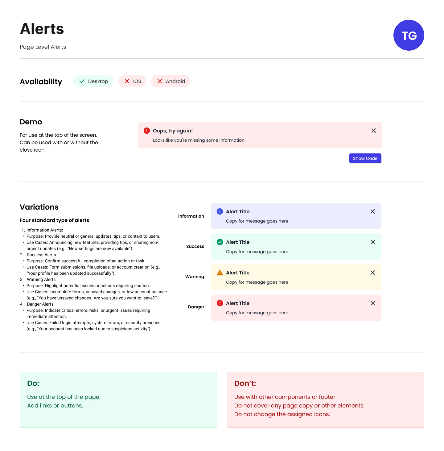
Example of documentation
